:
Last modified: Nov 27, 2023

Available UI components

Overview of the components that are available for use.

Available UI components

See documentation here: https://docs.altinn.studio/app/guides/design/guidelines/components/

Text components

Component nameAvailable propertiesProperties editorDefault look
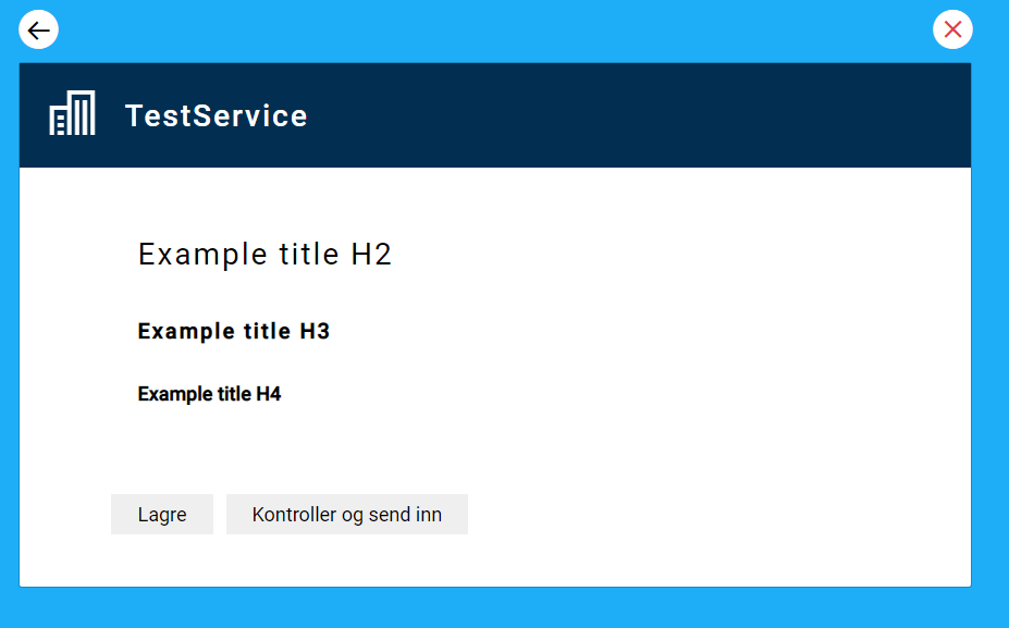
Title
("Header" in json)
  • Title text
    (text in json)
  • Title type H2, H3, H4
    ("L" or "h2", "M" or "h3", "S" or "h4" in json)
Title component - edit propertiesTitle component - default look
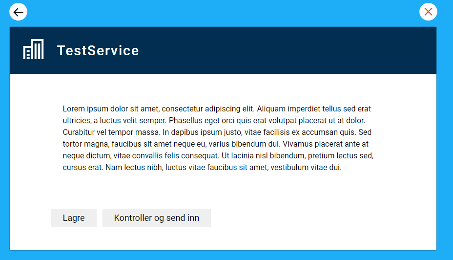
Paragraph
  • Paragraph text
Paragraph component - edit propertiesParagraph component - default look

Basic form components

Component nameAvailable propertiesProperties editorDefault look
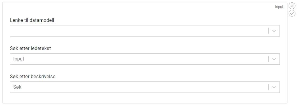
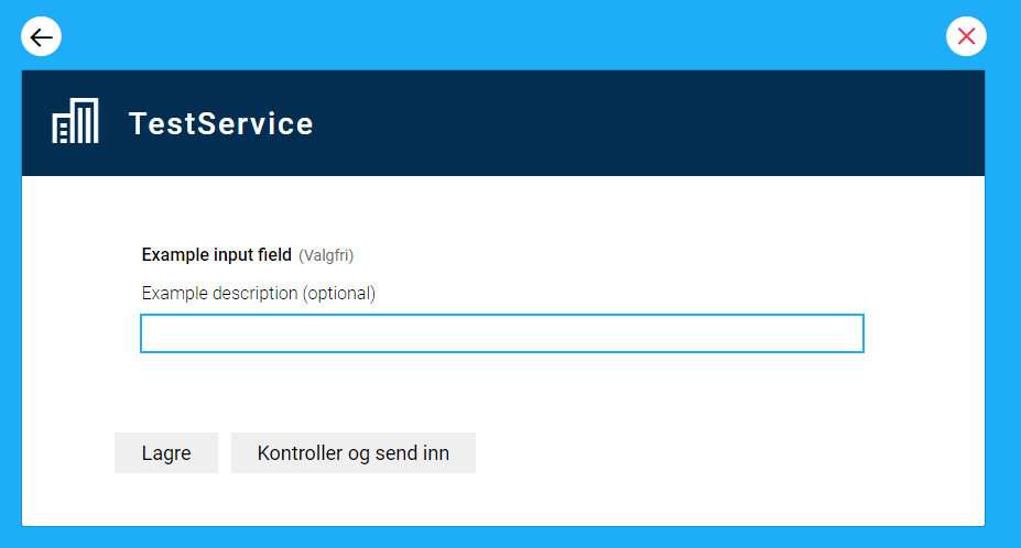
Input
  • Link to data model
  • Label text
  • Description text
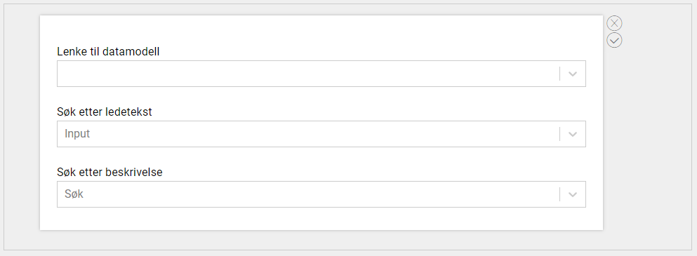
Input component - edit propertiesInput component - default look
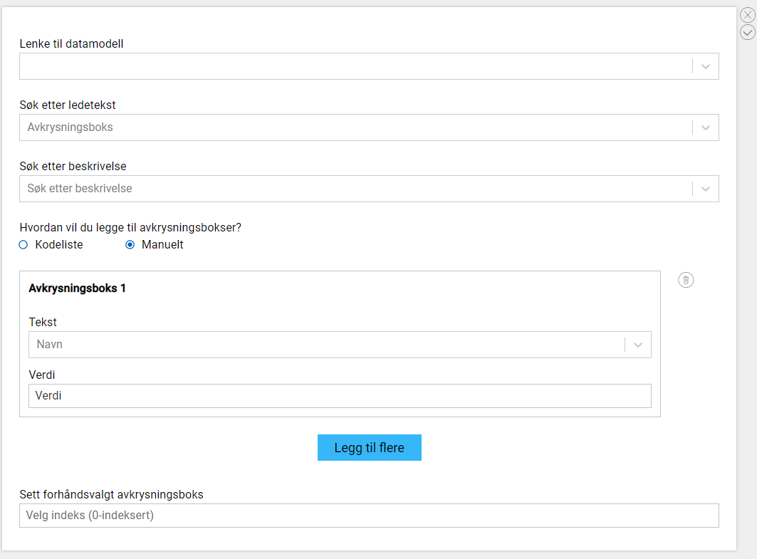
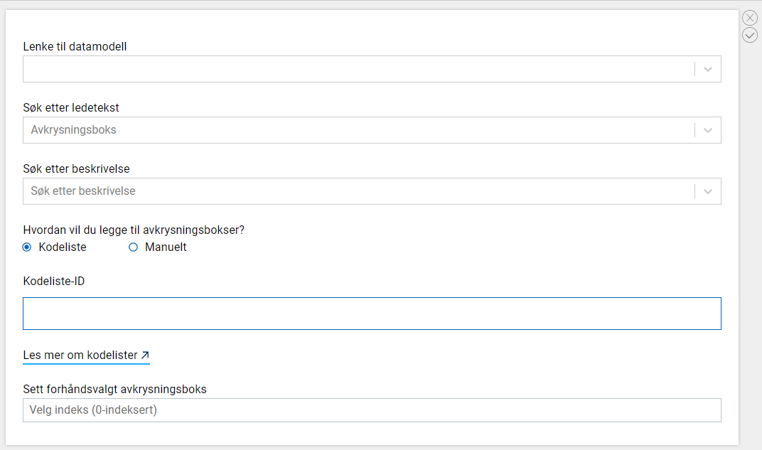
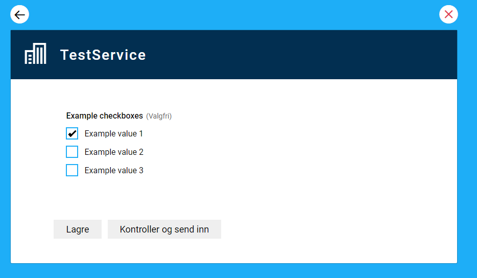
Checkboxes
  • Link to data model
  • Label text
  • Description text
  • Method to add options (codelist/manual)
  • Codelist name
  • Manual option
    • Label
    • Value
  • Pre-selected choice
Manual adding of options
Checkboxes component - edit properties
Adding options via codelist
Checkboxes component - edit properties
Checkboxes component - default look
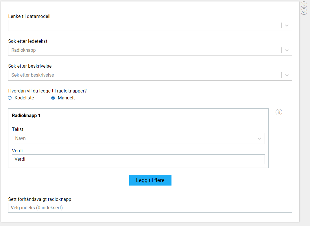
Radio buttons
  • Link to data model
  • Label text
  • Description text
  • Method to add options (codelist/manual)
  • Codelist name
  • Manual option
    • Label
    • Value
  • Pre-selected choice
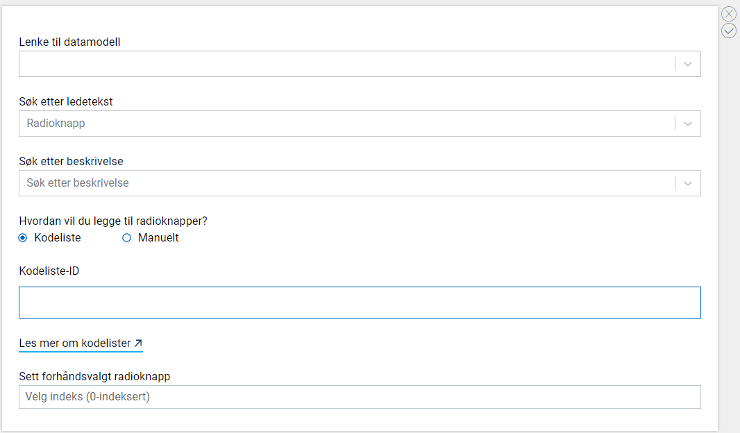
Manual adding of options
Radio buttons component - edit properties
Adding options via codelist
Radio buttons component - edit properties
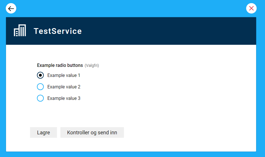
Radio buttons component - default look
Dropdown
  • Link to data model
  • Label text
  • Description text
  • Codelist id
Dropdown - edit properties
Dropdown - default look
Text Area
  • Link to data model
  • Label text
  • Description text
  • Read only
Text area component - edit propertiesText area component - default look
Datepicker
  • Link to data model
  • Label text
  • Description text
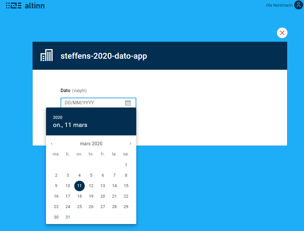
Text area component - edit propertiesText area component - default look
Button
  • Action (not configurable in MVP)
  • Label text
TBATBA
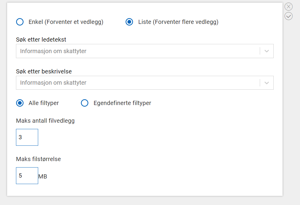
File UploadFile upload component - edit propertiesFile upload component - default look
NOTE: To make a File Upload component optional, make sure to set the minimum number of attachments to 0. The ‘optional’ value (used on other components) does not work for file upload.

Advanced form components

Advanced form components are components that potentially contain multiple fields that each need to be mapped to a field in the data model. They will typically contain fields that are functionally related, ex. fields related to address, see below.

NOTE: The address component is a proof of concept. The content/design of this component and its configuration is under development. The component is available for use, but might undergo major changes in the future.
Component nameAvailable propertiesProperties editorDefault look
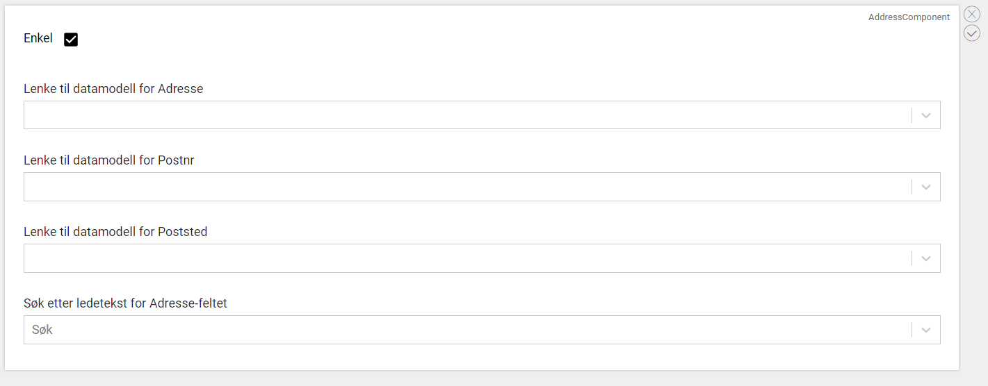
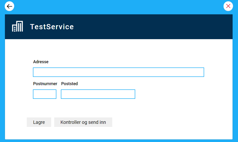
Address component
(simple mode)
  • Link to data model for field:
    • Address
    • Postal code
    • Postal area
  • Label text for Address field
Address (simple mode) - edit propertiesAddress (simple mode) - default look
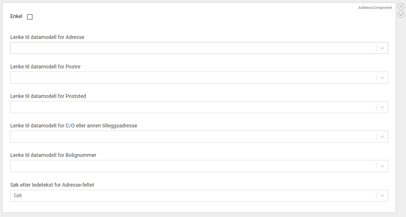
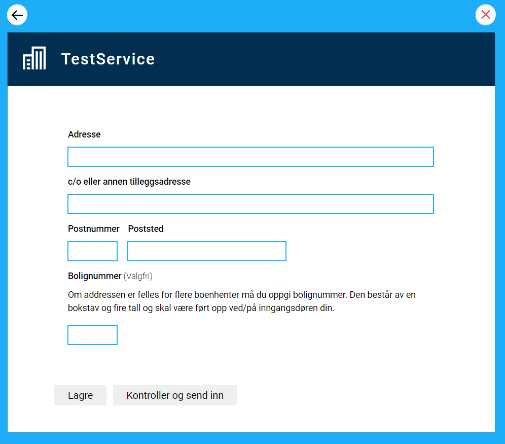
Address component
(advanced mode)
  • Link to data model for field:
    • Address
    • Postal code
    • Postal area
    • C/O
    • Housing number
  • Label text for Address field
Address (advanced mode) - edit propertiesAddress (advanced mode) - default look
Group
  • Group id
  • Repeating group
  • Link to data model
  • Number of repetitions
Group - edit properties
Non edit view
Group - edit properties
Group - default look

See all Github issues for UI-editor.