Navigation between pages
How to set up navigation between pages.
Navigation to the next and previous page happens via navigation buttons. These must be added manually in every layout file where you want to be able to navigate.
Add buttons for navigation
Buttons for navigation are added to all layout files where it is needed. If you want the button to appear at the bottom of the page, it has to be added at the bottom in the layout file. Configuration example:
{
  "id": "nav-page2",
  "type": "NavigationButtons",
  "textResourceBindings": {
    "next": "next",
    "back": "back"
  },
  "showBackButton": true
}
| Parameter | Description |
|---|---|
| id | Unique ID, the same as for all schema components. |
| type | Has to be "NavigationButtons" |
| textResourceBindings | By setting the parameters next (and back), you are able to override the default texts to be shown on the buttons. |
| showBackButton | Optional. Makes two buttons (back/next) appear instead of just one (next). |
Order
The page order is defined in the Settings.json file for the layout set by setting the pages.order property. Example:
App/ui/*/Settings.json{
"pages": {
"order": ["side1", "side2"]
}
}
If you want to dynamically hide specific pages, this can be done using Expressions.
Grouping pages
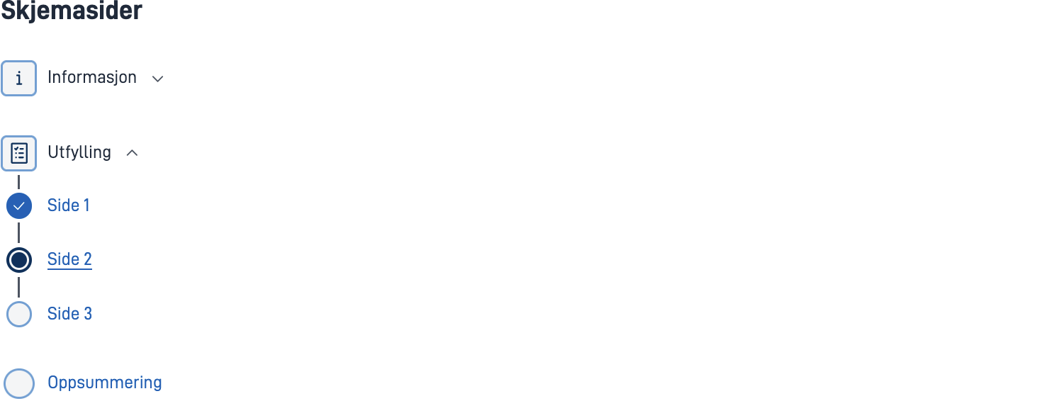
If you want to group pages or show the pages in a sidebar, you can use page groups as an alternative to the standard order. Replace the pages.order property with the pages.groups property as shown below:
App/ui/*/Settings.json{
"pages": {
"groups": [
{
"name": "group.info",
"type": "info",
"order": ["info1", "info2"]
},
{
"name": "group.form",
"markWhenCompleted": true,
"order": ["side1", "side2", "side3"]
},
{
"order": ["oppsummering"]
}
]
}
}
| Parameter | Description |
|---|---|
| name | Text resource defining the name of the page group. Required if order contains more than one page. |
| type | Optional. "info" | "default". |
| markWhenCompleted | Optional. Marks pages in the group as completed when all validation errors are fixed (and the user has seen the page). |
| order | Which pages are included in the group. |
Show process tasks in the navigation menu
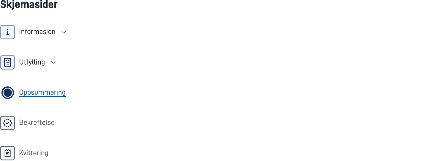
You can also show the other process tasks in the navigation menu. This can be configured for the entire app in layout-sets.json with the property uiSettings.taskNavigation, or for each layout set with the property pages.taskNavigation in Settings.json for the layout set. Example:
App/ui/layout-sets.json{
...
"uiSettings": {
"taskNavigation": [
{
"name": "task.form",
"taskId": "Task_1"
},
{
"taskId": "Task_2"
},
{
"type": "receipt"
}
]
}
}
| Parameter | Description |
|---|---|
| name | Optional. Text resource defining the name of the process task. |
| taskId | Which process task. Required if type is not set. |
| type | "receipt". Required if taskId is not set. |
Progress indicator
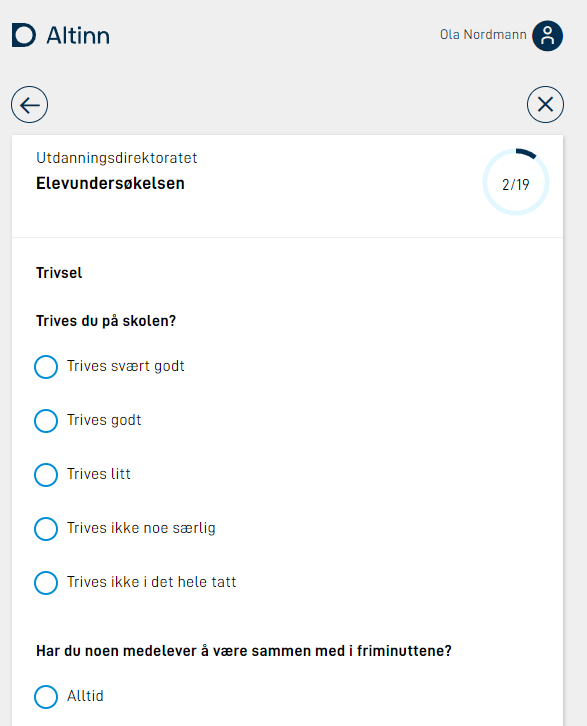
It is possible to enable a progress indicator that shows up in the top-right corner of the app, indicating how far along the user is in filling out all the application pages.
Configuring progress indicator
To set up this feature, add the following line to your Settings.json file:
App/ui/*/Settings.json{
"$schema": "https://altinncdn.no/toolkits/altinn-app-frontend/4/schemas/json/layout/layoutSettings.schema.v1.json",
"pages": {
"order": ["student-info", "school-work", "well-being"],
"showProgress": true
}
}
Navigation Bar
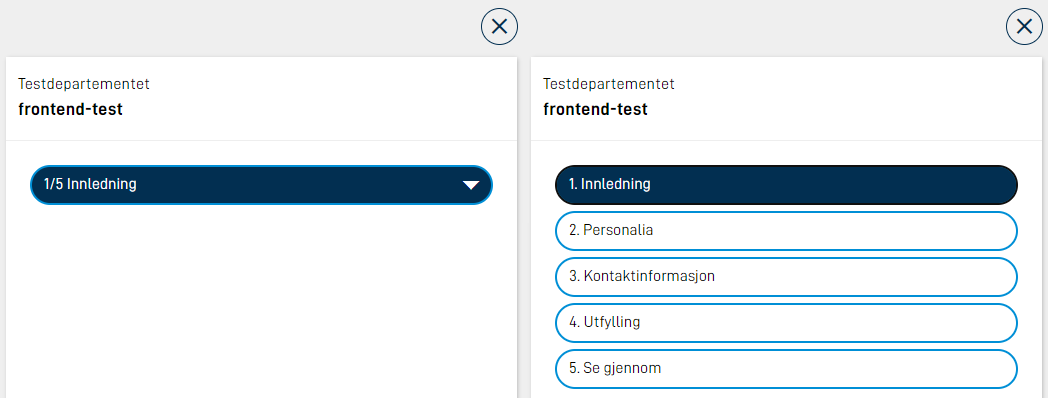
The Navigation Bar gives easy access to all pages in an application.
On big screens, all pages will be visible. If there is not enough space on one line, the list will break and the rest of the pages will go on the next line. On smaller screens, all pages will be hidden in a menu. The current page is shown in the menu, and when the menu is clicked, all pages will show.

The Navigation Bar is added to all layout files. Configuration example:
{
  "id": "navbar-page1",
  "type": "NavigationBar"
}
It can also be configured to display Navigation Bar mobile also in desktop viewport. In this case, this has to be set for all layout files. Configuration example:
{
  "id": "navbar-page1",
  "type": "NavigationBar",
  "compact": true
}
Change texts on navigation bar buttons
The text in the navigation bar buttons will by default use the filename of the page without the extension. F.ex if you have page1.json and page2.json, the buttons will contain page1 and page2. To override these texts, you can add texts in the resources.XX.json, where the id is the filename without extension. Example:
{
  "id": "page1",
  "value": "First page"
},
{
  "id": "page2",
  "value": "Last page"
},
Validation on page navigation
It is possible to check validation when the user tries to navigate to a different page, if there are validation errors, the user will be prevented from proceeding.
In version 4 of app frontend, the NavigationButtons component have properties called validateOnNext and validateOnPrevious that can be configured. Example:
{
  "id": "nav-buttons1",
  "type": "NavigationButtons",
  "textResourceBindings": {...},
  "validateOnNext": {
    "page": "current",
    "show": ["All"]
  }
}
Where page can be one of: current | all | currentAndPrevious, and show contains a set of validation types to check; this can be one or more of:
SchemaComponentExpressionCustomBackendRequiredAllExceptRequiredAll
Similarly, the NavigationBar component have the validateOnForward and validateOnBackward property:
{
  "id": "nav1",
  "type": "NavigationBar",
  "validateOnForward": {
    "page": "current",
    "show": ["All"]
  }
}
In version 3 of app frontend, add a trigger to the navigation button component:
{
  "id": "nav-buttons1",
  "type": "NavigationButtons",
  "textResourceBindings": {
    "next": "Neste",
  },
  "triggers": ["validatePage"],
}
There are three different triggers that can be used on page navigation:
| Trigger | Description |
|---|---|
validatePage | Runs validation on the components in the current page. The ID of the page that triggered the validation will be sent in the header LayoutId to the backend. |
validateAllPages | Runs validation on all components in all pages. Does not prevent the user from proceeding if there are no errors on the current or previous pages. |
validateCurrentAndPreviousPages | Runs validation on all components in the current page and all previous pages in the current order. |


