Customize Views of Step
How to customize views in different steps of a process.
An application wil have a process which the user of the application follows. Depending of the type of step the user is in, different views are presented. This page explains the different views and how they can be customized.
Data
In this process task a form which the user can fill in data.
The form can be edited using the UI editor or by changing FormLayout.json manually.
Confirmation
In this process task some standard texts are presented and the user can choose to confirm to go forward.
These texts can be overridden by manually adding each defined text keys in the apps text resources. More information about how this is done can be found here. In the following section we will present an overview of the different texts that can be customized.
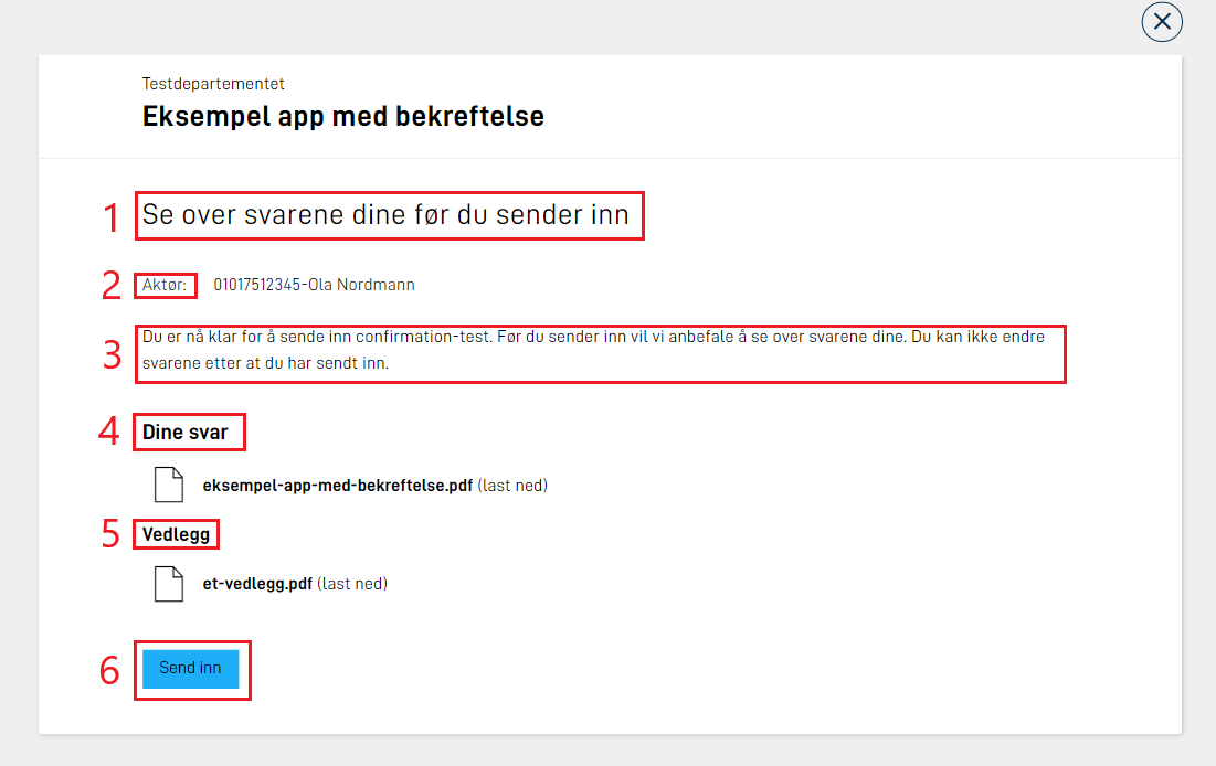
Customize texts
| Text # (see image above) | Text key |
|---|---|
| 1 | confirm.title |
| 2 | confirm.sender |
| 3 | confirm.body |
| 4 | confirm.answers |
| 5 | confirm.attachments |
| 6 | confirm.button_text |
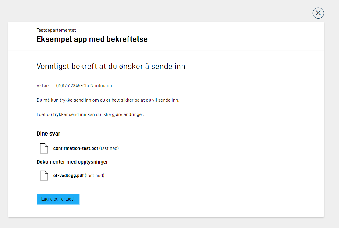
Example of custom texts in the file resources.nb.json:
{
  "id": "confirm.title",
  "value": "Vennligst bekreft at du ønsker å sende inn"
},
{
  "id": "confirm.body",
  "value": "Du må kun trykke send inn om du er helt sikker på at du vil sende inn. <br/><br/>I det du trykker send inn kan du ikke gjøre endringer."
},
{
  "id": "confirm.attachments",
  "value": "Dokumenter med opplysninger"
},
{
  "id": "confirm.button_text",
  "value": "Lagre og fortsett"
}
Note that in the example we have used the html-tag <br/> to make a line shift.
For links and formatting use markdown.
This results in the following view:
Custom form layout
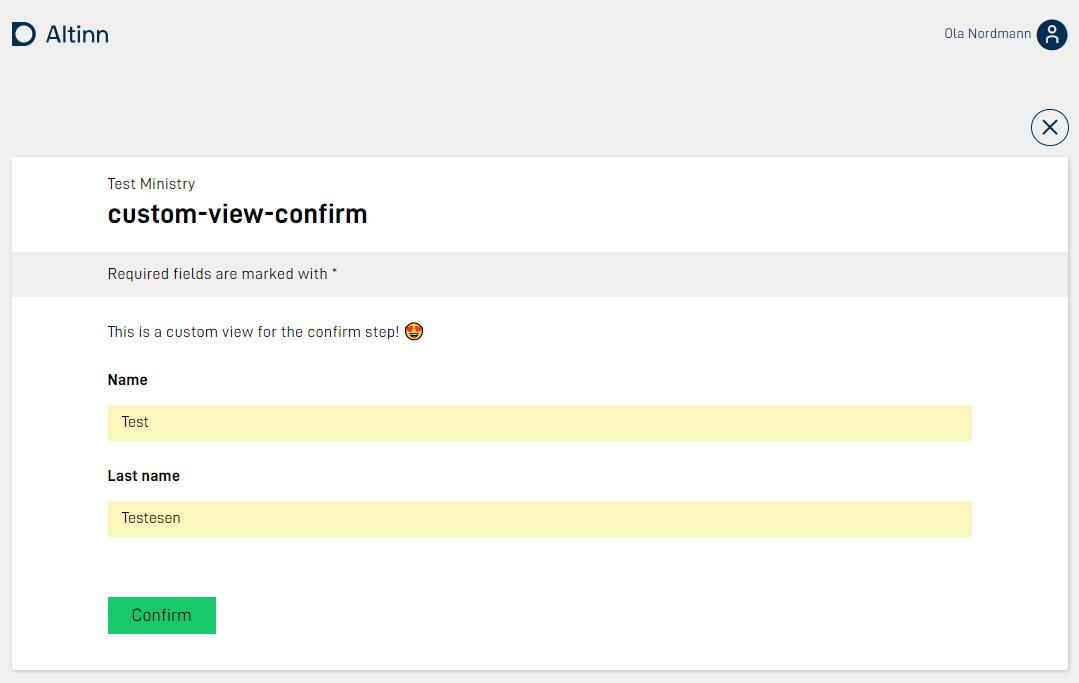
For the confirm task the app developer has the possibility for configuring their own layout set with corresponding form layout definitions and other ui-configuration files which are included in the data step.
This makes the confirmation page customizable, and can use the components that are supported in Altinn Studio.
Since the confirm step is not meant to be used for writing data, a good practice would be to use static components (
header, paragraph) and set other components to readOnly.
An example setup of the layout-sets.json where Task_1 is a data step, and Task_2 a confirmation step:
{
  "$schema": "https://altinncdn.no/toolkits/altinn-app-frontend/4/schemas/json/layout/layout-sets.schema.v1.json",
  "sets": [
    {
      "id": "simple",
      "dataType": "simple",
      "tasks": ["Task_1"]
    },
    {
      "id": "custom-confirmation",
      "dataType": "simple",
      "tasks": ["Task_2"]
    }
  ]
}
Notice that the layout-set configuration for Task_2 references the data model used in Task_1.
Example formLayout.json file that presents data from the data model used in the data-task:
{
  "$schema": "https://altinncdn.no/toolkits/altinn-app-frontend/4/schemas/json/layout/layout.schema.v1.json",
  "data": {
    "layout": [
      {
        "id": "paragraph",
        "type": "Paragraph",
        "textResourceBindings": {
          "title": "paragraph"
        }
      },
      {
        "id": "name",
        "type": "Input",
        "textResourceBindings": {
          "title": "name.label"
        },
        "dataModelBindings": {
          "simpleBinding": "Felt1"
        },
        "required": true,
        "readOnly": true
      },
      {
        "id": "lastname",
        "type": "Input",
        "textResourceBindings": {
          "title": "lastName.label"
        },
        "dataModelBindings": {
          "simpleBinding": "Felt2"
        },
        "required": true,
        "readOnly": true
      }
    ]
  }
}
The app structure would look look this:
├───App
│   ├───config
│   ├───logic
│   ├───models
|   | ...
│   ├───ui
│   │   ├───custom-confirmation
│   │   │   └───layouts
|   |   |   └─── ...
│   │   └───simple
│   │       └───layouts
|   |   |   └─── ...
The end result:
For a complete setup of this feature see our example app.
Feedback
This is a process step where the application owner can validate the filled data to generate a feedback before the data is archived.
In the following section we will present an overview of the different texts that can be customized.

Customize texts
| Text # (see image above) | Text key |
|---|---|
| 1 | feedback.title |
| 2 | feedback.body |
Example of custom texts in the file resources.nb.json:
{
  "id": "feedback.title",
  "value": "Vent på at tjenesteeier sjekker data"
},
{
  "id": "feedback.body",
  "value": "Når tjenesteier har sjekket at alle data er godkjent vil du bli automatisk sendt videre til siste steg i prosessen."
}
Receipt
In this process task the process will be ended and some standard texts are shown.
These texts can be overridden by manually adding each defined text key in the app’s text resources. More information about how this is done can be found here.
If the actual recipient of the form is a different organization than the organization owning the app, the receipt should reflect this in the Receiver field. This can be done by setting the text resource appReceiver to the name of the actual recipient.
Customize texts
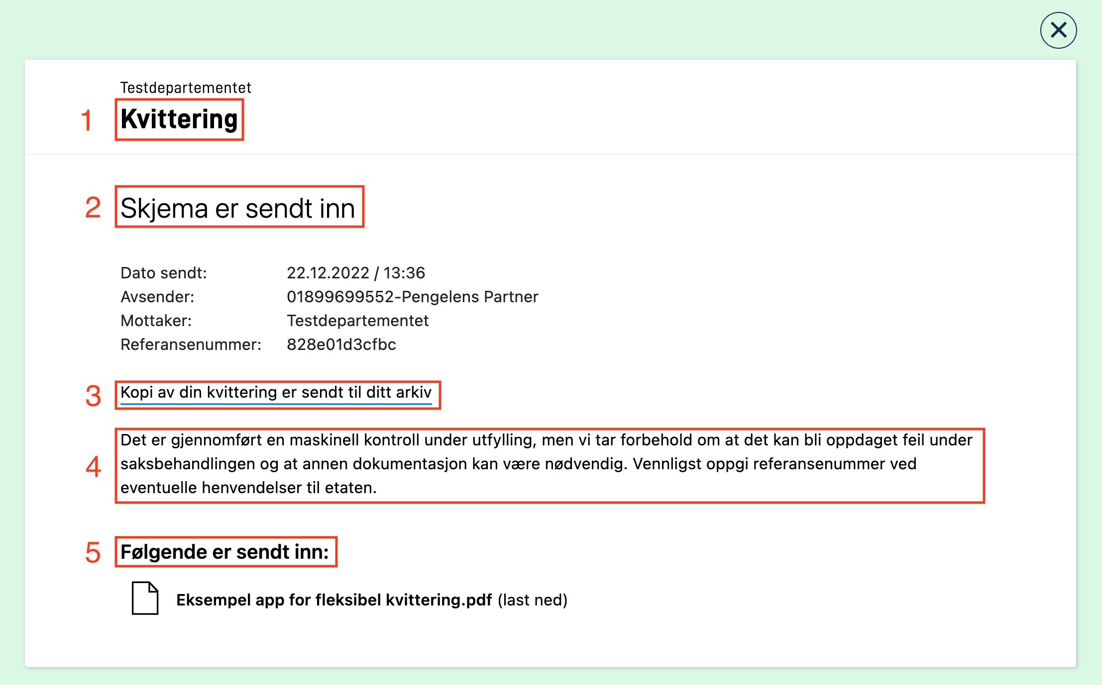
| Text # (see image above) | Text key |
|---|---|
| 1 | receipt.receipt |
| 2 | receipt.title |
| 3 | receipt.subtitle |
| 4 | receipt.body |
| 5 | receipt.title_submitted |
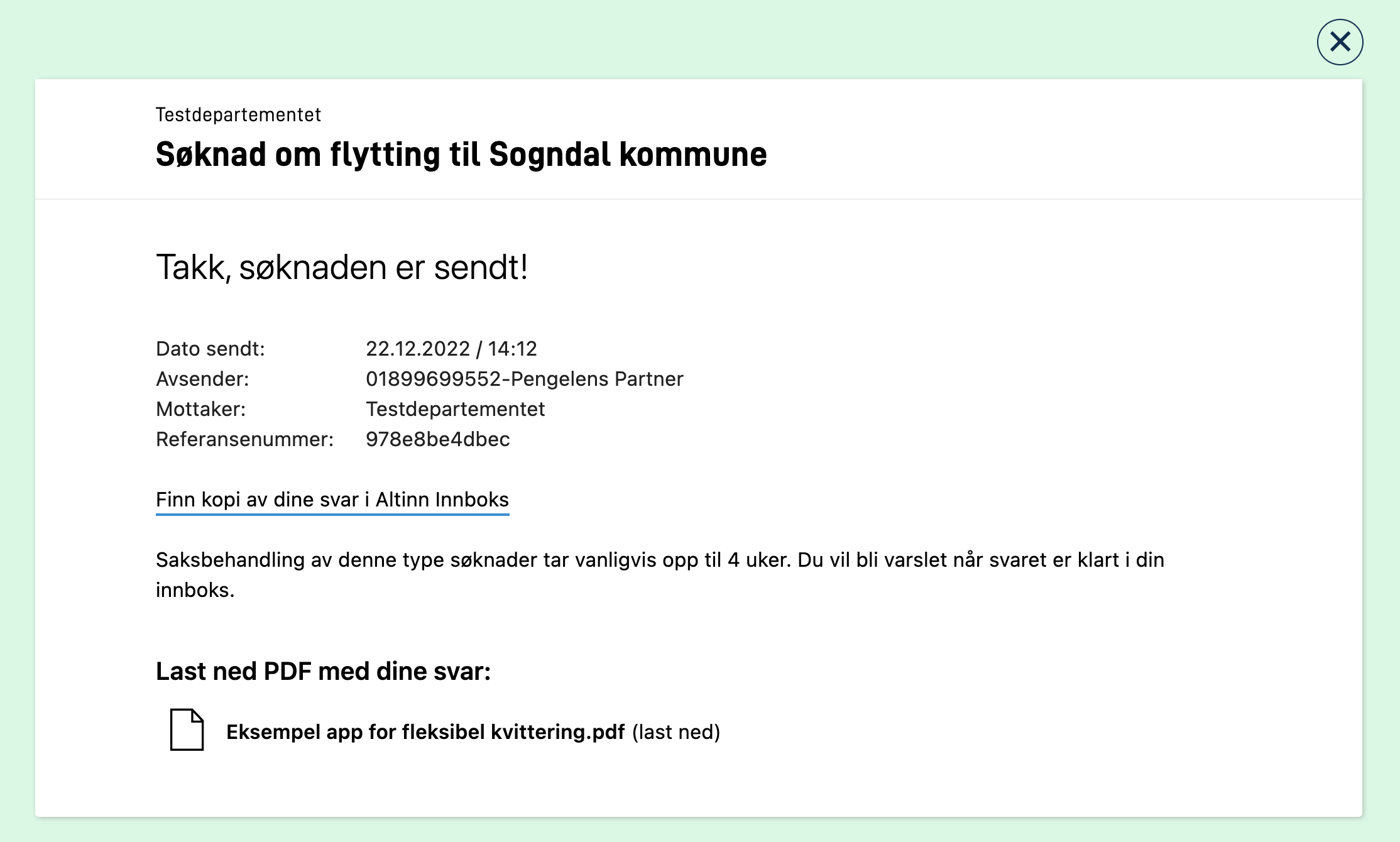
Example of custom texts in the file resources.nb.json:
{
  "id": "receipt.receipt",
  "value": "Søknad om flytting til Sogndal kommune"
},
{
  "id": "receipt.title",
  "value": "Takk, søknaden er sendt!"
},
{
  "id": "receipt.subtitle",
  "value": "Finn kopi av dine svar i Altinn Innboks"
},
{
  "id": "receipt.body",
  "value": "Saksbehandling av denne type søknader tar vanligvis opp til 4 uker. Du vil bli varslet når svaret er klart i din innboks."
},
{
  "id": "receipt.title_submitted",
  "value": "Last ned PDF med dine svar:"
}
Note that if you change the value of the text key receipt.subtitle the url will still point to Altinn Inbox.
This results in the following view:
Custom form layout
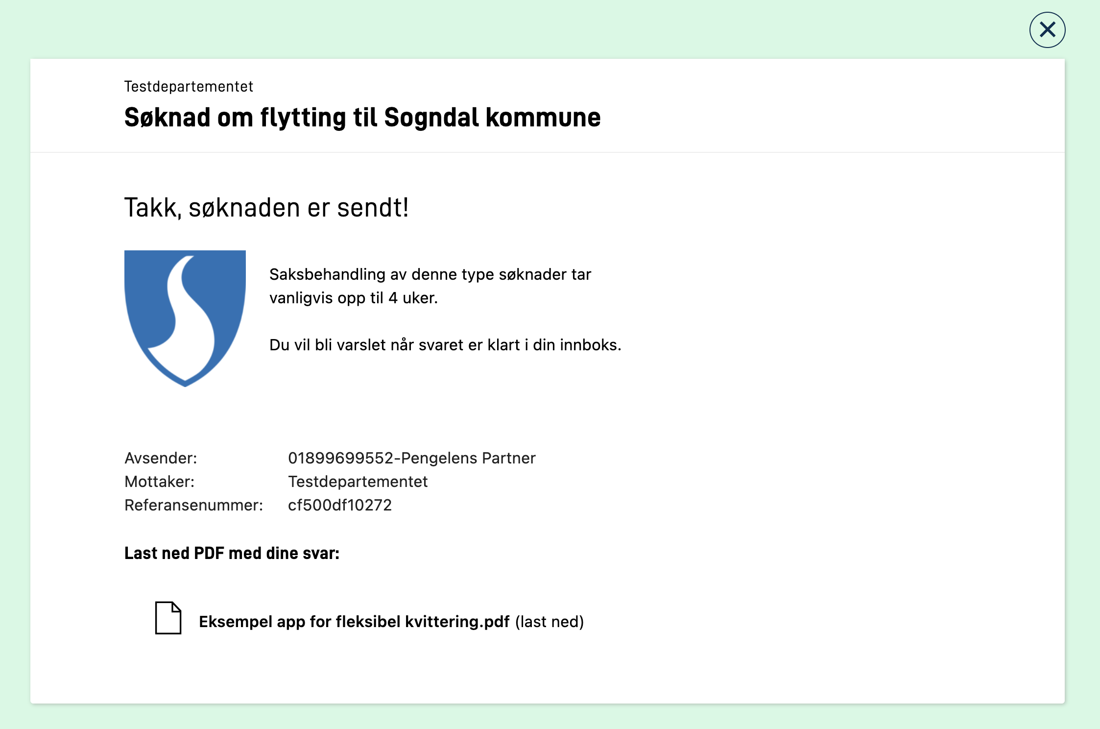
A custom receipt view can now be created in the same way as all other form pages. The functionality will also soon be available in Altinn Studio.
To create a custom receipt view, you create a new layout set. This layout set works exactly like
all other page types. Within the layout set, you can create a layouts folder and here define all the pages you want to
include in the receipt view (Yes, the receipt view supports multiple pages!). Inside the layout set, you must also create
a Settings.json, where you can define the order of the pages in the receipt view.
For the app to understand that this layout set should be used as a receipt view, you must refer to the name of the layout set
in layout-sets.json. Add a new layout set with id that refers to the name of your layout set, and add
the key value "CustomReceipt" in the tasks array of the layout set. In addition, you can specify which data model
should be available in the receipt view by adding the key dataType with the name of the data model you want to support.
Here is a complete example where we have a layout set named custom-receipt that will be used as a receipt view:
|- App/
  |- ui/
    |- layout-sets.json
    |- custom-receipt/
      |- layouts/
        |- page1.json
        |- page2.json
      |- Settings.json
App/ui/layout-sets.json{
"$schema": "https://altinncdn.no/toolkits/altinn-app-frontend/4/schemas/json/layout/layout-sets.schema.v1.json",
"sets": [
{
"id": "custom-receipt",
"dataType": "fields",
"tasks": ["CustomReceipt"]
}
]
}
App/ui/custom-receipt/Settings.json{
"$schema": "https://altinncdn.no/toolkits/altinn-app-frontend/4/schemas/json/layout/layoutSettings.schema.v1.json",
"pages": {
"order": ["page1", "page2"]
}
}
Example of a custom layout for the receipt:
App/ui/custom-receipt/layouts/page1.json{
"$schema": "https://altinncdn.no/toolkits/altinn-app-frontend/4/schemas/json/layout/layout.schema.v1.json",
"data": {
"layout": [
{
"id": "ReceiptHeader",
"type": "Header",
"textResourceBindings": {
"title": "receipt.title"
},
"dataModelBindings": {},
"size": "h2"
},
{
"id": "fa796d12-49fc-457a-9d9a-d153998d55de",
"type": "Image",
"textResourceBindings": {
"title": "Bilde"
},
"dataModelBindings": {},
"image": {
"src": {
"nb": "https://docs.altinn.studio/app/app-dev-course/modul2/kommune-logo.png"
},
"width": "100%",
"align": "flex-start"
},
"grid": {
"xs": 2
}
},
{
"id": "ReceiptParagraph",
"type": "Paragraph",
"textResourceBindings": {
"title": "receipt.body"
},
"grid": {
"xs": 10
}
},
{
"id": "ReceiptInstanceInformation",
"type": "InstanceInformation",
"elements": {
"dateSent": false
}
},
{
"id": "ReceiptHeader",
"type": "Header",
"textResourceBindings": {
"title": "receipt.title_submitted"
},
"size": "h4"
},
{
"id": "ReceiptAttachmentList",
"type": "AttachmentList",
"dataTypeIds": ["ref-data-as-pdf"],
"includePDF": true
}
]
}
}
Resulting receipt in the application:
Customizing texts in Simple Receipt
Simple receipt is a concept that becomes relevant for those applications that have enabled AutoDeleteOnProcessEnd: True in their applicationmetadata.json file. For more information on what this implies read here.
The texts in this receipt can also be overridden by manually adding each defined text keys in the apps text resources. More information about how this is done can be found here. In the following section we will present an overview of the different texts that can be customized.

| Text # (see image above) | Text key |
|---|---|
| 1 | receipt.receipt |
| 2 | receipt.title |
| 3 | receipt.body_simple |
Example of custom texts in the file resources.nb.json:
{
    "id": "receipt.receipt",
    "value": "Søknad om flytting til Sogndal kommune"
},
{
    "id": "receipt.title",
    "value": "Takk, søknaden er sendt!"
},
{
    "id": "receipt.body_simple",
    "value": "All data knyttet til denne innsendingen vil slettes etter tjenesteeieren har mottatt det."
}
This results in the following view:


