AccordionGroup
A component that lets you group Accordions
Usage
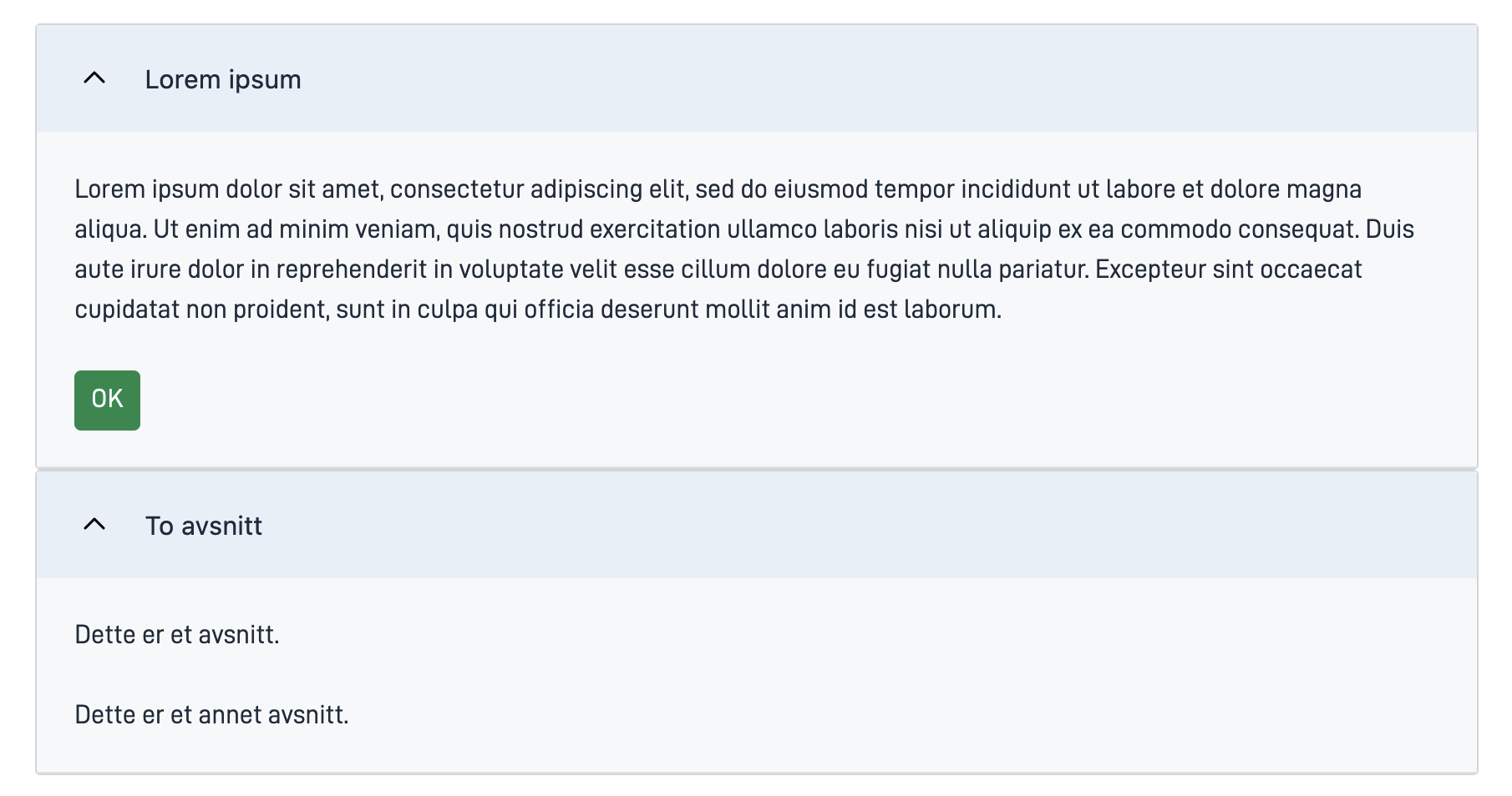
AccordionGroup is used to group related Accordion components.
Anatomy


- AccordionGroup: Grouping of two or more Accordion components.
- Header: The clickable section title that users interact with to expand or collapse the content.
- Content Area: The area that expands or collapses, revealing or hiding additional information when the header is clicked.
Note: Header and content area are properties of the Accordion child elements.
Related
Properties
| Property | Type | Description |
|---|---|---|
children | array | An array with the component ID of all components belonging to the group. Enum: "Accordion" |
Configuration
Add component
You can add a component in Altinn Studio Designer by dragging it from the left-side panel to the middle page area. Selecting the component brings up its configuration panel on the right-hand side.
Settings in Altinn Studio Designer
Property settings available in Altinn Studio Designer.
children property must be added to the component’s code.
See Add child elements- Komponent-ID (
id): Automatically generated component ID (editable).
Corresponding settings in the page’s JSON file.
children property must be added to the component’s code.
See Add child elementsApp/ui/layouts/{page}.json{
"data": {
"layout": [
{
"id": "accordion-group",
"type": "AccordionGroup"
}
]
}
}
Add child elements
Specify which components of type Accordion you want to group by adding their component ID’s to the children property as shown below.
The Accordion components must be added to the same page.
The order of the components in the group is given by the order of the component ID’s in children.
App/ui/layouts/{page}.json...
{
"data": {
"layout": [
{
"id": "accordion-group",
"type": "AccordionGroup",
"children": [
"accordion1",
"accordion2"
]
},
...
]
}
}
...
Example
App/ui/layouts/{page}.json{
"$schema": "https://altinncdn.no/toolkits/altinn-app-frontend/4/schemas/json/layout/layout.schema.v1.json",
"data": {
"layout": [
{
"id": "accordion-group",
"type": "AccordionGroup",
"children": [
"accordion1",
"accordion2"
]
},
{
"id": "accordion1",
"type": "Accordion",
"textResourceBindings": {
"title": "Lorem ipsum"
},
"children": [
"paragraph1",
"ok-button"
]
},
{
"id": "accordion2",
"type": "Accordion",
"textResourceBindings": {
"title": "To avsnitt"
},
"headingLevel": 2,
"children": [
"paragraph2",
"paragraph3"
]
},
{
"id": "paragraph1",
"type": "Paragraph",
"textResourceBindings": {
"title": "text.loremIpsum"
},
"dataModelBindings": {}
},
{
"id": "paragraph2",
"type": "Paragraph",
"textResourceBindings": {
"title": "Dette er et avsnitt."
},
"dataModelBindings": {}
},
{
"id": "paragraph3",
"type": "Paragraph",
"textResourceBindings": {
"title": "Dette er et annet avsnitt."
},
"dataModelBindings": {}
},
{
"id": "ok-button",
"type": "Button",
"dataModelBindings": {},
"textResourceBindings": {
"title": "OK"
}
}
]
}
}


