Panel
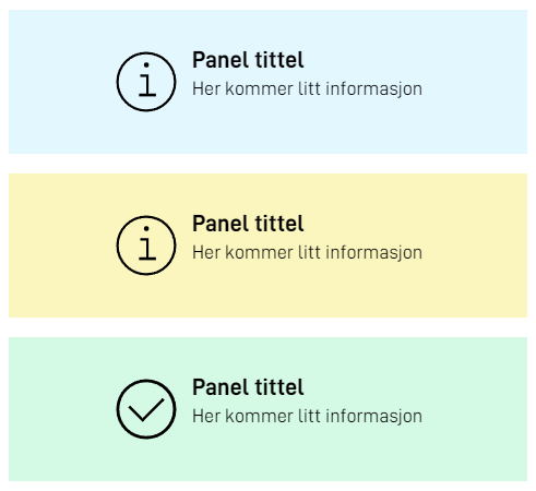
The panel component can be used to display important information to the user.

FormLayout.json example
{
  "id": "panelinfo",
  "type": "Panel",
  "textResourceBindings": {
    "title": "Info text",
    "body": "Some important information here"
  },
  "variant": "info",
  "showIcon": false
}
variant can be one of the following:
infosuccesswarning
showIcon can be used to hide/show the icon. By default the icon will be shown.

