

RadioButtons
Input element that allows the user to choose one of several options.
Usage
Radio buttons are often used in forms to collect input from the user where they need to choose only one of several options from a list.
Anatomy
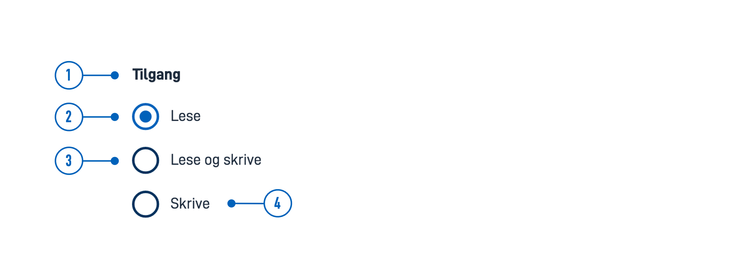
- Title - Question or instruction.
- Current Selection - Indicates the selected option.
- Option - Enables this option and disables the current selection.
- Label - Text label associated with the radio button.
Style
- Radio buttons should always have an associated label on the right side.
Best Practices
- List options in a logical order:
- most likely to least likely to be selected
- simplest to most complex operation
- least to most risk
- Preselect one option. Choose the safest, most secure, and private option first. If safety and security are not important, choose the most likely or convenient option.
- If users should have the option to avoid making a selection, add a “None” (or equivalent) option.
- If you cannot have a list of all possible options, add an “Other” option.
- Avoid alphabetical sorting as it is language-dependent and not localizable.
- Avoid overlapping options. For example, Select age: 0-20, 20-40 — What do you choose if your age is 20?
- Include all relevant options. For example, Select age: Below 20, Above 20 — What do you choose if you are 20?
Content guidelines
- Keep labels short and descriptive.
- Start all labels with a capital letter.
- Do not include punctuation after labels.
Related
- For a more compact way to display multiple options with single selection, use Dropdown.
- If users can choose multiple options from a list, use Checkboxes.
- For a more compact way to display multiple options with multiple selection, use MultipleSelect.
Properties
The following is an autogenerated list of the properties available for RadioButtons based on the component’s JSON schema file (linked below).
Required properties: id,type
| Property | Type | Description |
|---|---|---|
| string | The component ID. Must be unique within all layouts/pages in a layout-set. Cannot end with <dash><number>. |
| string | The component type. |
| object | Data model bindings for component |
basicDataModelBindings.simpleBinding | string | Data model binding for components connection to a single field in the data model |
| object | Text resource bindings for a component. |
basicTextResources.description | string | The description text for the component |
basicTextResources.help | string | The help text for the component |
basicTextResources.shortName | string | The short name for the component (used in validation messages) (optional). If it is not specified, 'title' text is used. |
basicTextResources.tableTitle | string | The text shown in column title when component is used in repeating group (optional). If it is not specified, 'title' text is used. |
basicTextResources.title | string | The title/label text for the component |
| boolean | Boolean or expression indicating if the component is required when filling in the form. Defaults to false. |
| boolean | Boolean or expression indicating if the component should be presented as read only. Defaults to false. <br /> <i>Please note that even with read-only fields in components, it may currently be possible to update the field by modifying the request sent to the API or through a direct API call.<i/> |
options.label | string | The option label. Can be plain text or a text resource binding. |
options.value | string | The option value. |
| string | Reference to connected options by id. |
| string | The HTML autocomplete attribute lets web developers specify what if any permission the user agent has to provide automated assistance in filling out form field values, as well as guidance to the browser as to the type of information expected in the field. Enum: [on, off, name, honorific-prefix, given-name, additional-name, family-name, honorific-suffix, nickname, email, username, new-password, current-password, one-time-code, organization-title, organization, street-address, address-line1, address-line2, address-line3, address-level4, address-level3, address-level2, address-level1, country, country-name, postal-code, cc-name, cc-given-name, cc-additional-name, cc-family-name, cc-number, cc-exp, cc-exp-month, cc-exp-year, cc-csc, cc-type, transaction-currency, transaction-amount, language, bday, bday-day, bday-month, bday-year, sex, tel, tel-country-code, tel-national, tel-area-code, tel-local, tel-extension, url, photo] |
| object | Settings for the components grid. Used for controlling horizontal alignment. Example(s): {xs: 12} |
gridSettings.innerGrid | gridProps | Optional grid for inner component content like input field or dropdown. Used to avoid inner content filling the component width. Example(s): {xs: 12}See: gridProps |
gridSettings.labelGrid | gridProps | Optional grid for the component label. Used in combination with innerGrid to align labels on the side. Example(s): {xs: 12}See: gridProps |
| boolean | Boolean value or expression indicating if the component should be hidden. Defaults to false. |
| mapping | Optionally used to map options |
| object | Mapping Example(s): {some.source.field: key1} |
| object | |
pageBreak.breakAfter | string | PDF only: Value or expression indicating whether a page break should be added after the component. Can be either: 'auto' (default), 'always', or 'avoid'. Example(s): auto,always,avoid |
pageBreak.breakBefore | string | PDF only: Value or expression indicating whether a page break should be added before the component. Can be either: 'auto' (default), 'always', or 'avoid'. Example(s): auto,always,avoid |
| integer | Sets a preselected index. |
| boolean | Boolean or expression indicating if the component should be rendered as a summary. Defaults to false. |
| boolean | Boolean value indicating if the options should be instance aware. Defaults to false. See more on docs: https://docs.altinn.studio/app/development/data/options/ |
| boolean | Boolean value indicating if the options should be displayed as cards. Defaults to false. |
| object | Object to define a data model source to be used as basis for options. Can not be used if options or optionId is set. See more on docs: https://docs.altinn.studio/app/development/data/options/ |
source.description | string | A description of the option displayed in Radio- and Checkbox groups. Can be plain text or a text resource binding. Example(s): some.text.key,My Description |
source.group | string | The repeating group to base options on. Example(s): model.some.group |
source.helpText | string | A help text for the option displayed in Radio- and Checkbox groups. Can be plain text or a text resource binding. Example(s): some.text.key,My Help Text |
source.label | string | Reference to a text resource to be used as the option label. Example(s): some.text.key |
source.value | string | Field in the group that should be used as value Example(s): model.some.group[{0}].someField |
Configuration
Add component
Basic component:
App/ui/layouts/{page}.json{
"$schema": "https://altinncdn.no/toolkits/altinn-app-frontend/4/schemas/json/layout/layout.schema.v1.json",
{
"data": {
"layout": [
{
"id": "radio-buttons",
"type": "RadioButtons"
}
]
}
}
}
Text (textResourceBindings)
You can create a new text by clicking on the plus sign or select an existing one by clicking on the magnifying glass. See Adding and Editing Texts in an App for more information.
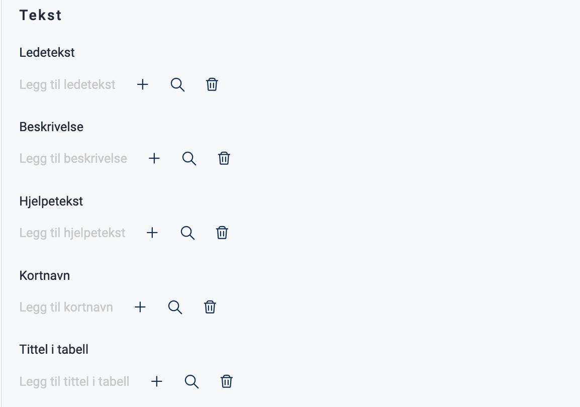
Text can be added directly as a text string or by providing the key to a [text resource].(/altinn-studio/reference/ux/texts/#add-and-change-texts-in-an-application).
App/ui/layouts/{page}.json{
"id": "komponent-id",
"type": "Checkboxes",
"textResourceBindings": {
"title": "",
"description": "",
"help": "",
"shortName": "",
"tableTitle": ""
}
}
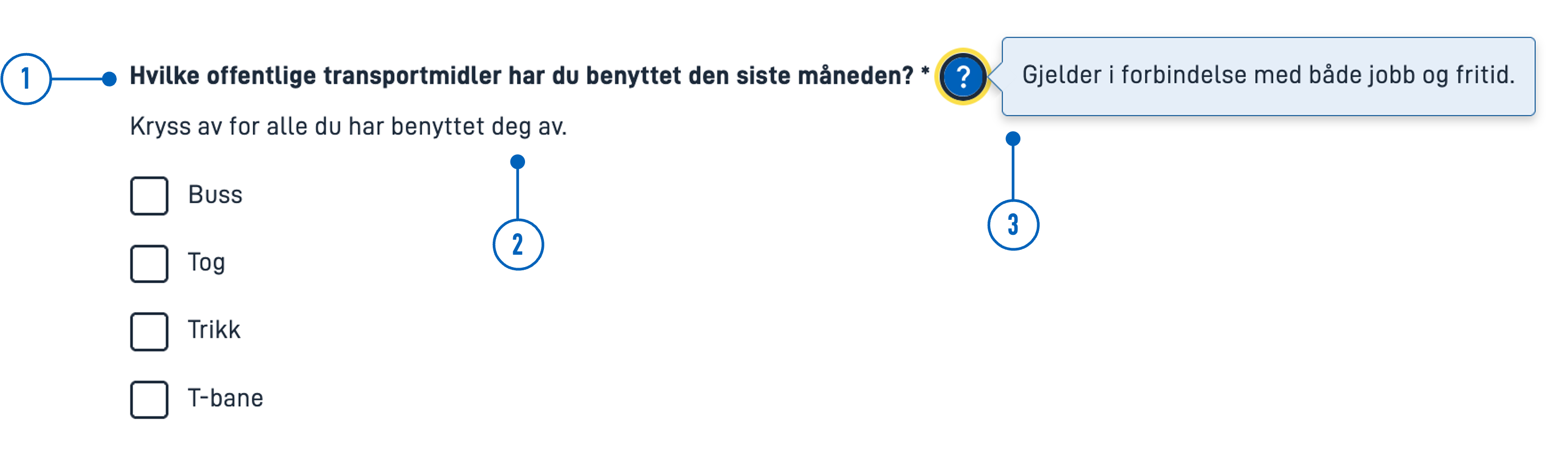
- Ledetekst (
textResourceBindings.title): A heading with a question or instruction. - Beskrivelse (
textResourceBindings.description): Description. Text for further description or elaboration. - Hjelpetekst (
textResourceBindings.help): Help text. When help text is filled out, a question mark will appear next to the heading. Click on the question mark to display the text as a popup. Can be used for explanations, examples, use cases, etc.
- Kortnavn (
textResourceBindings.shortName): Short name. Overrides the title of the component used in the defaultrequiredvalidation message. - Tittel i tabell (
textResourceBindings.tableTitle): Table title. Overrides the title of the component used in column headers when the component is within repeating groups.
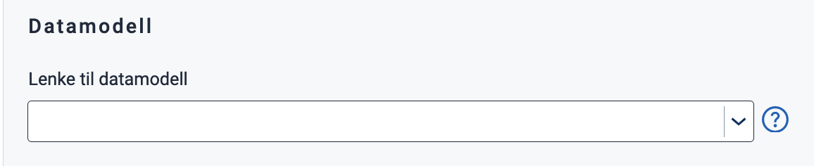
Data Model
To store and manipulate the data collected by the component, the component must be linked to a field in a data model. The option values are stored as strings.
Select the field you want to link the component to from the dropdown menu. If there are no fields available, you must first upload a data model.
App/ui/layouts/{page}.json{
"id": "komponent-id",
...
"dataModelBindings": {
"simpleBinding": "MyDataModel.SomeField"
}
}
Adding Options
Options can be added manually or by using code lists.
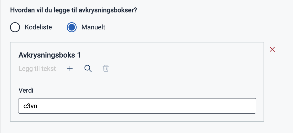
Manually (options)
Select “Manuelt” and click “Legg til flere” to add a new option. Choose or create a new text to add a label (label).
The option comes with a pre-filled value (value), which is the data that is stored when the user makes a selection.
The value is stored as a string and can be changed as you wish.
App/ui/layouts/{page}.json{
"id": "komponent-id",
...
"options": [
{
"label": "Alternativ 1",
"value": "1"
}
]
}
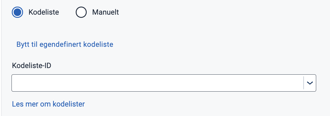
Code List (optionsId)
A code list is a predefined list of options.
To add options from a code list, select “Kodeliste” and enter a code list ID. To use a custom (dynamic) code list, click “Bytt til egendefinert kodeliste” (switch to custom code list).
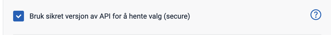
If you wish to secure dynamic code lists, you can check this option:
App/ui/layouts/{page}.json{
"id": "komponent-id",
...
"optionsId": "land",
"secure": true
}
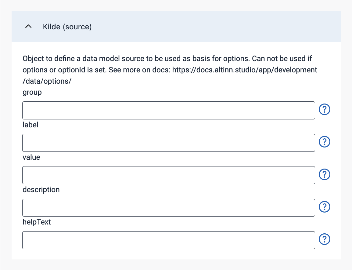
Source (source)
One way to add options is by linking the component to a code list based on form data stored within the app itself.
You can do this by adding a source (source); please refer to the documentation for instructions on how to configure this.
Settings in Altinn Studio.
App/ui/layouts/{page}.json{
"id": "komponent-id",
...
"source": {
"group": "some.group",
"label": "dropdown.label",
"value": "some.group[{0}].someField",
"description": "",
"helpText": ""
}
}
...
Documentation for code lists
- Link a Component to a Code List
- Static Code Lists
- Dynamic Code Lists
- Code lists based on repeating groups from the data model
Field is read-only (readOnly)
Disables the component when checked (true).

App/ui/layouts/{page}.json{
"id": "komponent-id",
...
"readOnly": true
}
Example read-only component
Required (required)
Field is required when enabled (true) and a star is shown after the heading.
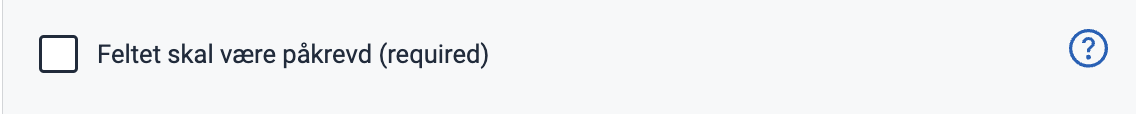
App/ui/layouts/{page}.json{
"id": "komponent-id",
...
"required": false
}
Layout (layout)
Displays the alternatives in a column (column) (default for more than two options) or row (row) (default for up to two options).
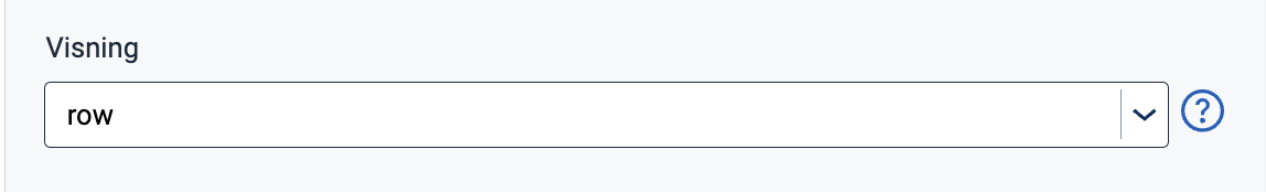
App/ui/layouts/{page}.json{
"id": "komponent-id",
...
"layout": "row"
}
Show as card (showAsCards)
Displays each radio button on a light gray background when checked (true).

App/ui/layouts/{page}.json{
"id": "komponent-id",
...
"showAsCard": true
}

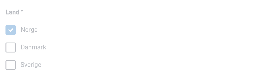
Preselected option (preselectedOptionsIndex)
Sets a preselected value. Options are zero-indexed, so the first option is 0, the second is 1, and so on.
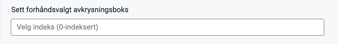
App/ui/layouts/{page}.json{
"id": "komponent-id",
...
"preselectedOptionsIndex": 0
}
Summary (renderAsSummary)
Indicates whether the field should be included in a summary or not (default: false).

{
  "id": "komponent-id",
  ...
  "renderAsSummary": false
}
Hidden (hidden)
Indicates whether the field should be hidden or not (default: false).

App/ui/layouts/{page}.json{
"id": "komponent-id",
...
"hidden": false
}
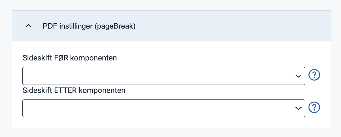
Page Break (pageBreak)
Indicates whether a page break should be added before or after the component. Can be either: auto (default), always, or avoid.
App/ui/layouts/{page}.json{
"id": "komponent-id",
...
"pageBreak": {
"breakBefore": "auto",
"breakAfter": "auto"
}
}
Horizontal alignment with grid
grid settings are not yet supported in the form editor but can be configured manually.The grid property controls horizontal alignment based on a 12-column layout.
Items are allocated fractions of 12 which sets their width relative to the screen width.
In the example below, we set the component’s width to 2/12 of the screen width for all screen sizes (from xs and up).
App/ui/layouts/{page}.json{
"id": "komponent-id",
...
"grid": {
"xs": 2,
}
}
You can also use grid to place items side by side.
See Components placed side by side (grid) for details and examples.