Styling
How to control the styling, formatting and grid layout of an app.
This is new functionality. Setup must be done manually for now. Support for setup through Altinn Studio will be launched shortly.
NOTE: to use this functionality you need app-frontend version 3. See this link for changes that is required in the app.
Components placed side by side (grid)
It is possible to place components side by side in a form. This functionality is based on the grid system from Material-UI, and is similar to the grid system from bootstrap. The grid system is based on a construction of containers in 12 parts, where you can assign children (items) of a grid-container a given part of this width. Material-UI also offers the ability to dynamically change how much of the screen you want to occupy based on which screen size the user is on. The following sizes with breakpoints are defined:
- xs: 0px
- sm: 600px
- md: 1024px
- lg: 1440px
- xl: 1920px
To place components side by side horizontally, small changes must be done in form layout. A separate property grid has
been defined, where you can fill in desired width on the different sizes. Here is an example where two input fields has
been set to cover half the screen (some props are removed for readability):
 {
     {
        "id": "input-felt1",
        "type": "Input",
        ...
        "grid": {
          "xs": 6,
        }
      },
      {
        "id": "input-felt2",
        "type": "Input",
        ...
        "grid": {
          "xs": 6
        }
      }
}
For the components above, the size has been set to 6 (half width) for the size xs. Since: xs is the smallest size available, this will apply from size xs and up, i.e. from xs to xl.
The setup above will give the following result:
Since there are 12 sections available on the page width, it is up to the app developer to assign how large of a share a component should have. If you want a component to take up 2/12, and another 6/12 and the last one 4/12, then this is possible. It is important to consider the user experience when performing these changes, and before you place components side by side you should think it through. Components with longer texts and descriptions quickly become small and unclear if these are placed side by side. If you are to use longer texts and descriptions it is recommended that these occupy the full width of the form.
If you in the example above wanted the components to take up the whole width of the screen, until the screen passed 960px in size, you could set up the following layout:
 {
     {
        "id": "input-felt1",
        "type": "Input",
        ...
        "grid": {
          "xs": 12,
          "sm": 12,
          "md": 6
        }
      },
      {
        "id": "input-felt2",
        "type": "Input",
        ...
        "grid": {
          "xs": 12,
          "sm": 12,
          "md": 6
        }
      }
}
Then, the components would not be be placed side by side unless the user is using a screen of 960px or more.
innerGrid og labelGrid
In addition to setting the width of the grid in the component, we also have added the opportunity to control innerGrid and labelGrid.
This gives you the opportunity to control the width of label and input in the same way. This is typically used when
you want to make an input field smaller (to give a visual indication that a small answer is expected), or if you want to display
label and input on the same line (like in a table.)
You can think of the component in this manner:
<Grid id="grid">
    <Grid id="labelGrid">
        Komponentens tekster
    </Grid>
    <Grid id="innerGrid">
        Komponentens input
    </Grid>
</Grid>
Here, you will have the opportunity to control the width of both the outer grid and the inner grid. Example:
{
     {
        "id": "input-felt1",
        "type": "Input",
        ...
        "grid": {
          "xs": 12,
          "innerGrid": {
              "xs": 6
          }
        }
      }
}
Here, it has been set that the component grid shall occupy the whole width, while limiting the component’s input to only occupy half the width. Inner grid can be controlled for these components:
- Input
- TextArea
- FileUpload
- Dropdown
- Datepicker
The example above will give the following output:
A tableview with labels placed to the side will appear if you set labelGrid and innerGrid so that the sum equals 12
(or less). This may be wise if you have a long list of related questions. It is often wise to not use
such a layout on the smallest screens, so feel free to use md.
{
     {
        "id": "input-felt1",
        "type": "Input",
        ...
        "grid": {
          "labelGrid": {
              "md": 8
          },
          "innerGrid": {
              "md": 4
          }
        }
      }
}
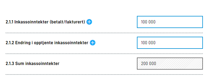
This will look something like this:
Two radiobuttons or checkboxes vertically aligned
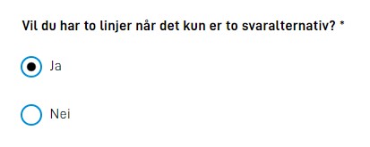
By default radiobuttons and checkboxes with only two options will be displayed on one line. If you would like them to be displayed below each other as this:
you need to change/add “layout”:“column” in the component configuration.
{
        "id": "radio-under-hverandre",
        "type": "RadioButtons",
        "textResourceBindings": {
          "title": "Vil du har to linjer når det kun er to svaralternativ?"
        },
        "dataModelBindings": {
          "simpleBinding": "someRadiobuttonFieldWith2Options"
        },
        "options": [
          {
            "value": "1",
            "label": "Ja"
          },
          {
            "value": "0",
            "label": "Nei"
          }
        ],
        "required": true,
        "layout": "column"
      }
Formatting numbers
Support has now been implemented to be able to specify formatting of numbers in input fields. This is done by adding a property formatting to
the input component. Formatting options are documented in a JSON-schema,
and will appear automatically in intellisense when editing the component in e.g. VSCode.
The example below will result in an input field for numbers, where the number will be formatted with , between each thousand, and $ in front of the number.

{
  "id": "numberComponent",
  "type": "Input",
  "textResourceBindings": {
    "title": "number",
  },
  "dataModelBindings": {
    "simpleBinding": "someNumberField"
  },
  "required": true,
  "readOnly": false,
  "formatting": {
    "number": {
      "thousandSeparator": ",",
      "prefix": "$"
    }
  }
},
Language-sensitive number formatting
It is possible to assign dynamic formatting of numbers in input fields. You can choose between "currency" and "unit". Based on selected language in the app, they formatting thousand and decimal separators and prefix/suffix.
You can optionally add a position, and valid values are "prefix" and suffix.
Default positions is prefix when formatting a currency and suffix for units.
Examples:
"currency": "NOK", position: "prefix""unit": "kilogram", position: "suffix"
App developers can choose to leave some of the parts independent of the language. Properties in number overrides dynamic formatting. The configuration below makes prefix display as kr and thousand separator as whitespace. Otherwise in english, prefix would be NOK and thousand separator ","
{
  "id": "numberComponent",
  "type": "Input",
  "formatting": {
    "currency": "NOK",
    "position": "prefix",
    "number": {
      "thousandSeparator": " ",
      "prefix": "kr"
    }
  }
},
Valid values for currency are ISO 4217 currency codes, such as NOK for Norwegian kroner. List of valid currencies
Valid values for unit are for now the following list:
celsius | centimeter | day | degree | foot | gram | hectare | hour | inch | kilogram | kilometer | liter | meter | milliliter | millimeter | millisecond | minute | month | percent | second | week | year
Aligning text in input fields
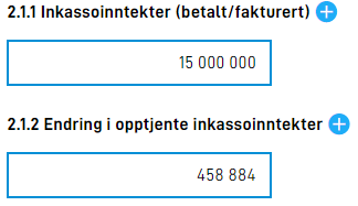
When a schema contains a list of numbers that are automatically summarized, it is common to align text to the right,
like when summarizing on paper and how Excel shows numbers. This can be done by setting "align": "right"
under formatting
on the input component. Other valid values are "center" and "left".
{
  "id": "numberComponent",
  "type": "Input",
  ...
  "formatting": {
    "number": {
      "thousandSeparator": " ",
      "prefix": "kr "
    },
    "align":"right"
  }
},


