Adding components to Studio
Get started making a new component available to the forms builder in Altinn Studio
This guide will explain how to add a new component to the Altinn Studio forms builder.
Pre-requisites:
- The new component must be implemented in app-frontend.
- Studio must be set up to run locally to test your changes.
Add the component to the toolbar
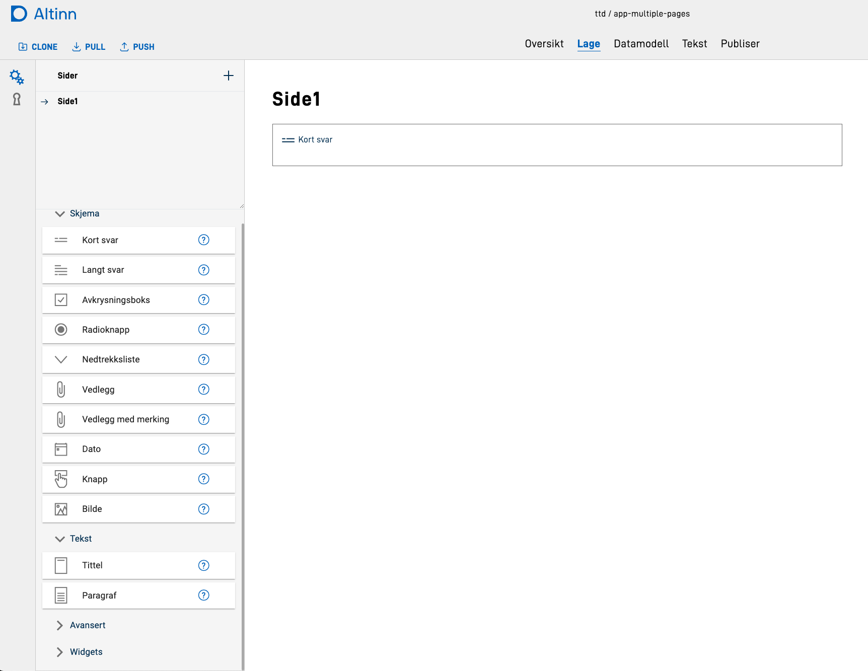
All components that can be added to a form from Altinn Studio are shown in the toolbar on the left-hand side of the window:
To add your component to the toolbar, do the following steps:
- Navigate to the forms-builder code, which is located in
frontend/packages/ux-editor. - Open the file
src/components/index.ts - Add your new component to the
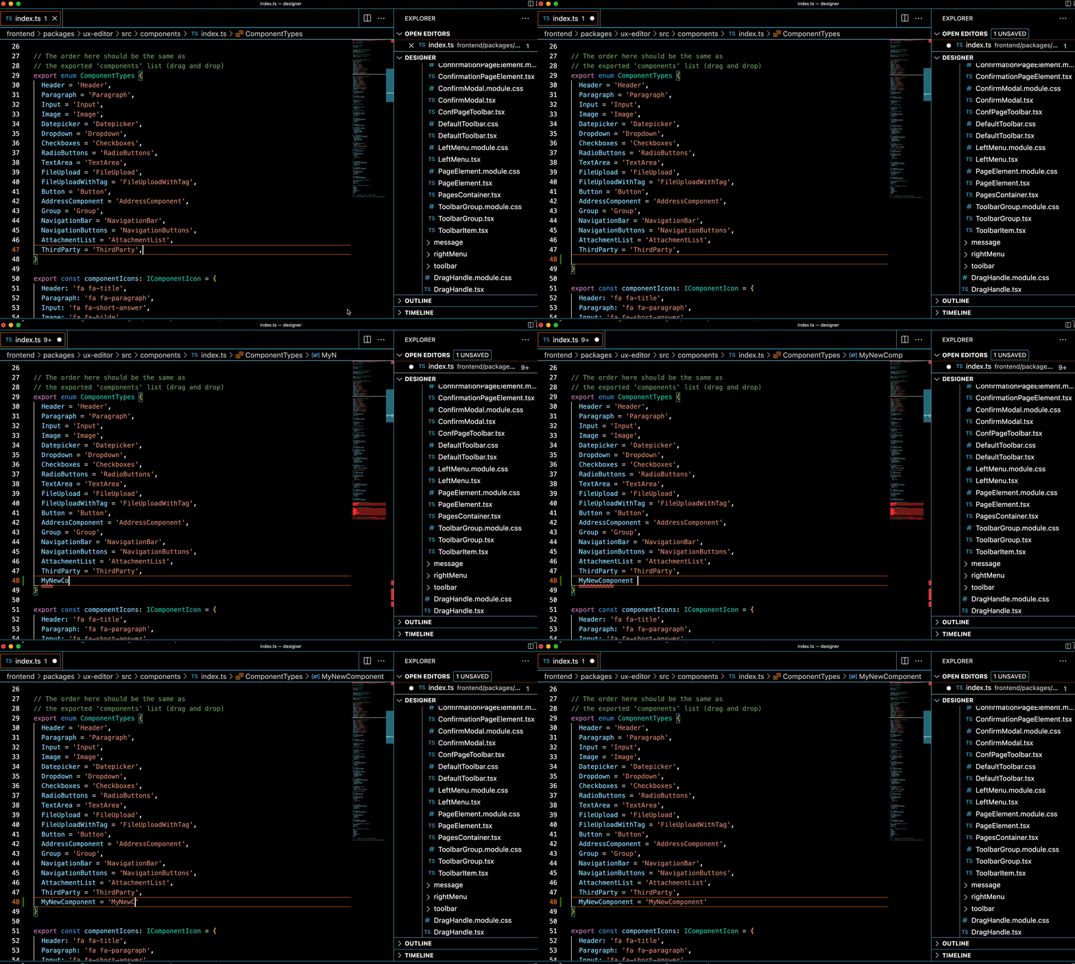
ComponentTypesenum - make sure you use the same naming as you have used for thetypeproperty of your component in the layout files.
Update ComponenTypes enum - Set an icon for your component in the toolbar in the
componentIconsobject. Available icons can be found here, use namingfa fa-<icon name>. - Add a new object describing your new component.
The object must have type
IComponent, and can contain the following properties:Property Description nameComponent name, use the ComponentTypesenum as valueIconComponent icon, use the componentIconsproperty you createdcustomPropertiesObject containing any custom properties that the component should be initialized with (default values) - Add your newly created component definition to the relevant list:
schemaComponentsfor basic form componentstextComponentsfor components that are primarily displaying textsadvancedComponentsfor more complex components.
When you now open Altinn Studio locally and navigate to the forms builder, you should see your new component in the toolbar, and should be able to drag it into the form.
Set up options to edit component
All components will display the id field available for editing when trying to edit a component. To set up editing of
other properties for the component, follow the instructions below.
- Navigate to
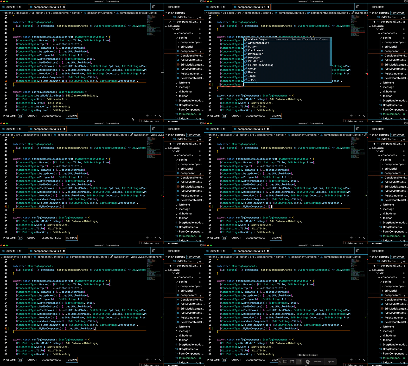
src/components/config/componentConfig.ts. - Find the
componentSpecificEditConfigobject, add your new ComponentType enum value as key, and add a new list of settings that can be edited.Current properties that are supported for editing directly are:
- dataModelBindings
- size (Header component)
- title (textResourceBindings.title)
- description (textResourceBindings.description)
- readOnly
- required
- options
- optionsId (codeList)
- preselectedIndex
If you need to edit any other properties for a component, consider if it is something that is relevant for only your component, or if it could be reused. If it can be used by other components, feel free to add it to the list of
configComponentsby implementing it, see the existing components as examples.Many components have the same set of properties that should be edited:
dataModelBindings, title, description, readOnly, required. we have collected these into a reusable list callededitBoilerplatewhich can be used instead of typing all the property names when relevant.
Set up config for components
- If you have custom needs for editing your component, you can do the following:
- Add a new folder under
src/components/config/componentSpecificContentwith the name of your component. - In this folder, implement the view that can be used to edit your component. See existing
componentSpecificContentfor examples. Create anindex.tsfile form the component folder and export your newly implemented edit component view from there. - Open
src/components/config/componentSpecificContent/ComponentSpecificContent.tsx - Add a new case to the
switch/casestatement with your component. Import the custom view you just created and render it here, inside a<FieldSet>component.
- Add a new folder under
- Note that it is possible to combine this custom approach with the standard approach described above. If you have any of the standard properties to edit, use the config setup, and create a custom view for anything that is not covered by that.
When you add your component to the form now, and open the editing view, you should see all the properties that you have added (standard and custom) available to edit.

