

Grid
The Grid component is used to visually arrange components in a table
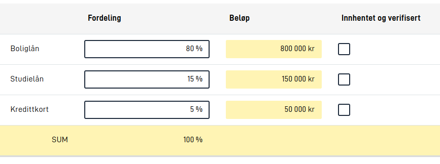
Configuration
The Grid component requires a configuration for rows and cells. To start with a 2x2 Grid having two columns and two rows, we can use the following configuration:
{
  "id": "myGrid",
  "type": "Grid",
  "rows": [
    {
      "cells": [{ "text": "Cell 1" }, { "text": "Cell 2" }]
    },
    {
      "cells": [{ "text": "Cell 3" }, { "text": "Cell 4" }]
    }
  ]
}
Each cell should either be an object with a text property (for text cells), an object with a component property
(referencing other components), an object with a labelFrom property (referencing other components) or null (for an empty cell). Each row must have the same amount of cell objects as
every other row.
Note that the mobile view of a Grid only shows the components. The components in the cells must therefore also work on their own. Read more about this in the pitfalls section below.
Rows
On some rows, usually the first, you might want to configure a header row. To do this, add a header property to the row
and set it to true. This will make the row have a different background color and make the text bold.
{
  "header": true,
  "cells": [{ "text": "Cell 1" }, { "text": "Cell 2" }]
}
Similarly, a row can also be configured to be read-only. This will make the row have a yellow background color. To
configure a row as read-only, add a readOnly property to the row and set it to true.
{
  "readOnly": true,
  "cells": [{ "text": "Cell 3" }, { "text": "Cell 4" }]
}
Note that components inside a readOnly are not automatically set to readOnly as well. If you want to make a component
inside a readOnly row read-only, you need to configure it manually for that component.
Rows can also be hidden, and a whole row will automatically be hidden if the following rules are met:
- The row has at least one component reference (not just empty cells and text cells)
- All component references in the row points to components that are currently hidden
In other words, rows that only have text cells will never be hidden, and even if the row has text cells, these cells will not be taken into account when the Grid component decides whether to hide the row or not.
Cells
Cells can be configured to be either as either text cell or a component cell. To configure a cell as a text cell, add a text
property to the cell and set it to the text you want to display. You can also specify a text resource key as the text
to display in the cell. Additionally, it is possible to include a help property along with the text property to provide help text for the cell. Alternatively, you can retrieve the text content
from a component’s text resources by using labelFrom property with the id of the component. By specifying a labelFrom you can retrieve text resources such as title, description, and help.
To configure a cell as a component cell, add a component property to the cell and set it to
the id of the component you want to display in the cell.
{
  "cells": [
    { "text": "Text content in cell 1" },
    { "text": "text.resource.key" },
    { "text": "Text content in cell 3", "help": "Help text for cell 3" },
    { "labelFrom": "myComponent" },
    { "component": "myComponent" }
  ]
}
In the above configuration, the myComponent is assumed to be a component that is configured elsewhere in the layout.
Currently, a selection of components are supported in the Grid component. These are:
- Button
- Checkboxes
- Custom (subject to the custom implementation)
- Datepicker
- Dropdown
- Header
- Image
- Input
- InstantiationButton
- MultipleSelect
- Paragraph
- PrintButton
- RadioButtons
- TextArea
For RadioButtons and Checkboxes, the option label will not be displayed if there is only one option to choose from when being displayed inside a Grid.
When displayed in a table, components will not render their title and description text resources. However, these
text resources should still be set on the component, as they will be used for accessibility purposes, and will still
be displayed when the component is displayed outside of a Grid - such as on smaller screens and in
a Summary.
Column spanning and column hiding
The Grid component supports both column spanning (colSpan) and column hiding (hidden).
colSpanlets a cell cover multiple columns. It can be configured viacellStyle.colSpan.hiddenhides an entire column. It applies at the column level (header + the corresponding cells in the rows below), and it can be configured only viacolumnOptions.hidden.
Example with colSpan:
{
  "header": true,
  "cells": [
    { "text": "All changes", "cellStyle": { "colSpan": 2 } },
    null
  ]
}
Example with hidden:
{
  "header": true,
  "cells": [
    { "text": "Column A" },
    { "text": "Column B", "columnOptions": { "hidden": true } },
    { "text": "Column C" }
  ]
}
Note: When using colSpan, you must remove the cells covered by the column span or set them to null, otherwise the table layout may become unpredictable.
Note: If you configure a cell so its colSpan covers one or more columns that are also hidden, the table still renders, but the layout may not match what you expect. In development, the app logs a short warning in the browser console that describes which cell spans how many columns and that it overlaps hidden column(s), and that this may cause unexpected layout. Avoid combining a colSpan with hidden columns if you need a predictable table.
Widths, text and alignment
There ar multiple properties in a cell that can be used to control the width, text and alignment of a cell, and how much text is displayed before it is truncated. These options are:
width- The width of the column. The value can contain a percentage, for example"25%", or"auto"(default). Should be set on the first column, and will then apply to all cells in that column.alignText- Choose between"left","center"or"right"to align the text in the cell accordingly. This has no effect for cells with components, only cells with text.textOverflow- Used to control the behavior when the text content is too large to fit in a cell. Has no effect for cells with components, only cells with text.lineWrap- The text will wrap to the next line. This is the default behavior. Set tofalseto disable.maxHeight- The text will be truncated after a certain number of lines. Set to0to disable.
You can override a column’s alignText and textOverflow settings for a specific text cell by adding the attributes
directly to the selected text cell.
Example:
{
  "cells": [
    {
      "text": "Cell 1",
      "width": "25%",
      "alignText": "left",
      "textOverflow": {
        "lineWrap": false,
        "maxHeight": 0
      }
    },
    {
      "component": "myComponent",
      "width": "75%"
    }
  ]
}
Mobile support
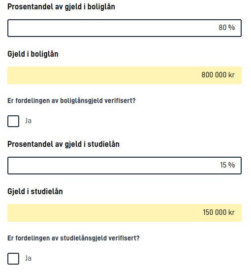
Grid arrangement of components is useful to give the user a better overview of the content of a page and related
fields when the screen is large enough. However, such a table view is not optimal for smaller screens, so the Grid
component will automatically display the components (as if they were not part of a Grid) on smaller screens. Text cells
and cells that use labelFrom are not shown on mobile. The order of the components will be the same as the order of
the rows and cells in the Grid configuration (one row at a time). The order of the individual components as they are
defined in the layout configuration therefore has no significance.
The same applies to displaying a Grid component in a Summary, where the same components
referenced in the Grid will be displayed as a summary of single components, without showing text cells or labelFrom
cells.
Pitfalls
When you configure the Grid component, it may seem correct at first glance to split label text and components into different cells. On a large screen, this will look correct, but it gives unexpected behavior on mobile and when using a screen reader.
As an example, here is a common pitfall in Grid configuration:
[
  {
    "id": "grid-example",
    "type": "Grid",
    "textResourceBindings": {
      "title": "Reporting valuables",
      "description": "The government wants to know about all the valuables you have collected."
    },
    "rows": [
      {
        "header": true,
        "cells": [
          { "text": "Valuable" },
          { "text": "Count" }
        ]
      },
      {
        "cells": [
          { "text": "Stamps" },
          { "component": "stamp-count" }
        ]
      },
      {
        "cells": [
          { "text": "Old pennies" },
          { "component": "old-penny-count" }
        ]
      }
    ]
  },
  {
    "id": "stamp-count",
    "type": "Input",
    "dataModelBindings": {
      "simpleBinding": "Valuables.Stamps.Count"
    },
    "textResourceBindings": {
      "title": "Count"
    }
  },
  {
    "id": "old-penny-count",
    "type": "Input",
    "dataModelBindings": {
      "simpleBinding": "Valuables.OldPennies.Count"
    },
    "textResourceBindings": {
      "title": "Count"
    }
  }
]
In a screenshot of this configuration, it will look correct on a large screen:
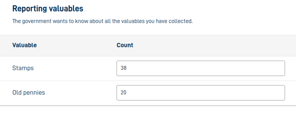
In this example, a user who navigates to the answer field with a screen reader will only hear the text “Count”, without knowing what the field is about. This also becomes clear on a smaller screen:
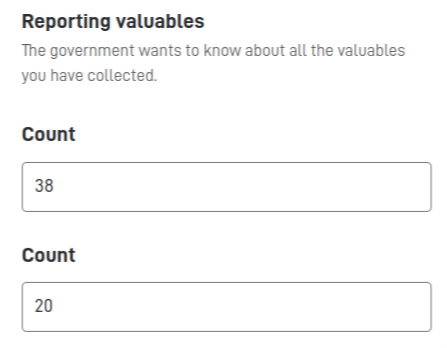
In the mobile view, you only see the components. The text cells are not shown, so the information in them is therefore lost for mobile users.
There are two ways to solve this:
- If the text in the cell can be the same as the component label, give the component a more descriptive label and reference it with
labelFrominstead oftext. - If the cell needs different text from the component label, use
text. Make sure the label and any description on the component still give the user all the information they need.