

Repeating groups
Setup for repeating groups
Groups in the data model contain one or more fields. In the Layout configuration, a component is configured to be a
repeating group by setting the type to "RepeatingGroup". A group that is repeating in the data model must also be set
up as repeating in the form, if not, data saving will fail. In JSON, a repeating group is defined as an array of objects,
where each object is a group. In XML, a repeating group is defined as a list of elements, where each element is an object
with properties.
Example
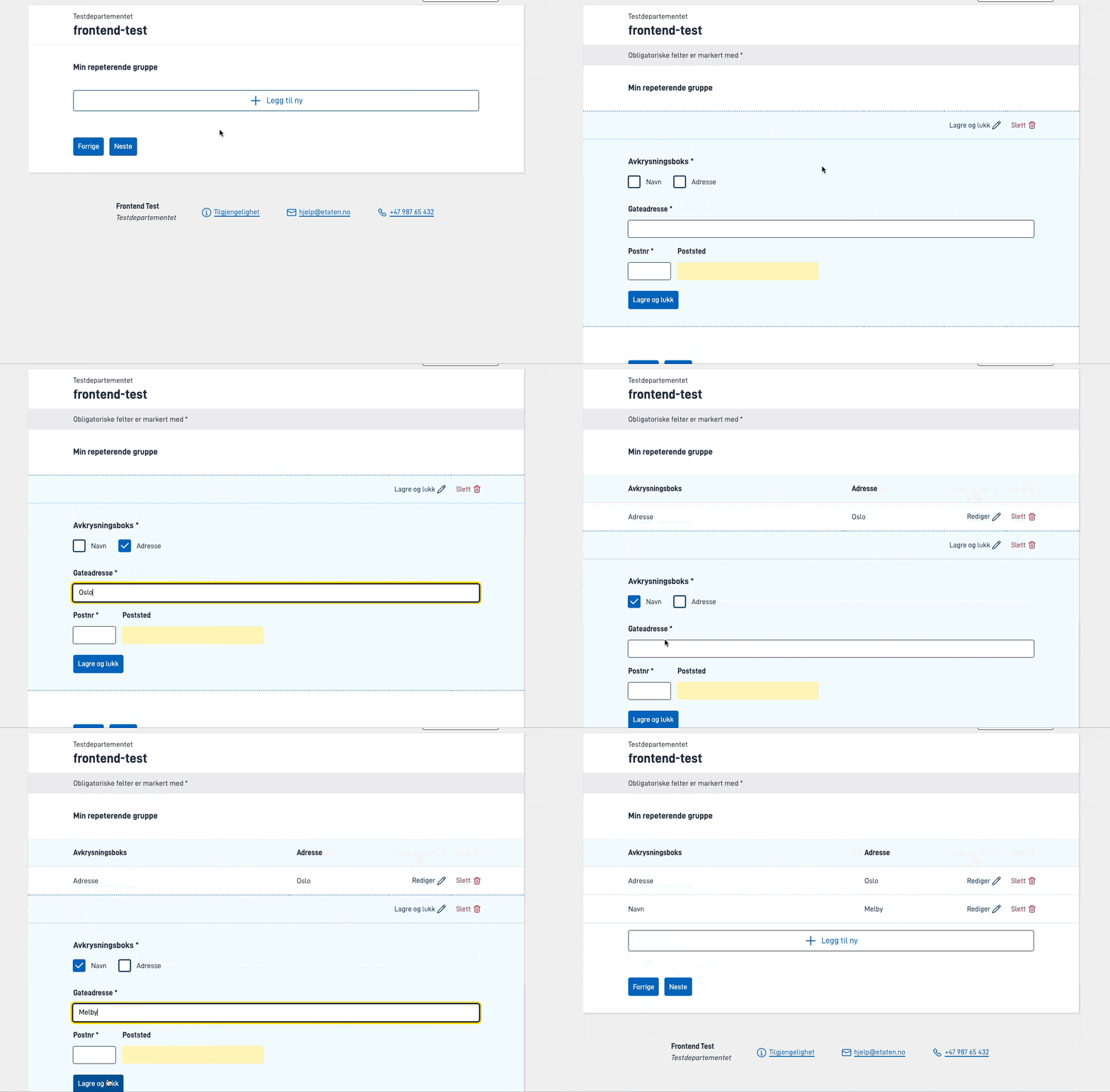
Below is a form with a repeating group that:
- Contains two components (checkbox and address)
- Can be repeated up to three times
- Is bound to the data model group/array
GruppeListe
Parameters
| Parameter | Required | Description |
|---|---|---|
| id | Yes | Unique ID, same as ID on other components. Must be unique in the layout file, and should be unique across pages. |
| type | Yes | Must be ‘RepeatingGroup’ |
| dataModelBindings | No | Must be set for repeating groups with form components inside. Should point to the repeating group in the data model. |
| textResourceBindings | No | Can be set for repeating groups, see description. |
| maxCount | No | The number of times a group can repeat. |
| minCount | No | Validation. The minimum number of times a group must repeat before the user can submit the form. |
| children | Yes | List of the component IDs that are to be included in the repeating group. |
| edit | No | Options for how to display the group when editing a row. |
| tableHeaders | No | List of components that are to be included as part of the table header fields. If not specified, all components are displayed. |
| tableColumns | No | Object containing column options for specified headers. If not specified, all columns will use default display settings. |
| rowsBefore | No | Static Grid-style rows shown before the repeating rows in the table view. |
| rowsAfter | No | Static Grid-style rows shown after the repeating rows in the table view. |
| stickyHeader | No | If set to true, the table headers will be sticky. |
rowsBefore/rowsAfter: colSpan and hidden columns
rowsBefore and rowsAfter use the same grid row/cell structure as the Grid component.
- Cells in these rows support
colSpanviacellStyle.colSpan. - Column hiding is configured with
columnOptions.hiddenon cells in a header row. - To hide a column in
rowsBefore/rowsAfter, setcolumnOptions.hiddenon the corresponding cell in a header row (“header”: true).
Note: When using colSpan, cells covered by the span must be removed or set to null.
Note: If you configure a cell so its colSpan covers one or more columns that are also hidden, the table still renders, but the layout may not match what you expect. In development, the app logs a short warning in the browser console that describes which cell spans how many columns and that it overlaps hidden column(s), and that this may cause unexpected layout. Avoid combining a colSpan with hidden columns if you need a predictable table.
Example rowsBefore/rowsAfter without overlap between colSpan and hidden:
"rowsBefore": [
  {
    "header": true,
    "cells": [
      {},
      { "text": "Summary before", "cellStyle": { "colSpan": 2 } },
      null,
      { "text": "Hidden before", "columnOptions": { "hidden": true } }
    ]
  }
],

"rowsAfter": [
  {
    "header": true,
    "cells": [
      {},
      { "text": "All changes", "cellStyle": { "colSpan": 2 } },
      null,
      { "text": "Hidden after", "columnOptions": { "hidden": true } }
    ]
  }
]
textResourceBindings
It is possible to add different keys in textResourceBindings to overrule default texts.
title- title to show above the group and over each group row in a Summary component.summaryTitle- If set, overrides title when displaying a Summary component.description- A description to show above the group beneath the title.add_button- is added at the end of the “Add new” text on the button, and can be used to e.g. get text that says “Add new person”.add_button_full- is used as custom text on the “Add new” button. Overridesadd_buttonif both are set.save_button- is used as text on the “Save” button when the user is filling out data.save_and_next_button- is used as text on the “Save and open next” button if enabled.edit_button_open- is used as text on the “Edit” button on the table when the user is opening an element.edit_button_close- is used as text on the “Edit” button on the table when the user is closing an element.
Groups in the data model contain one or more fields. Groups are defined as repeating if they have maxCount > 1 in
the layout configuration. A group that is repeating in the data model must also be set up as repeating in the form, if
not, data saving will fail. In JSON, a repeating group is defined as an array of objects, where each object is a group.
In XML, a repeating group is defined as a list of elements, where each element is a group/object with properties.
Example
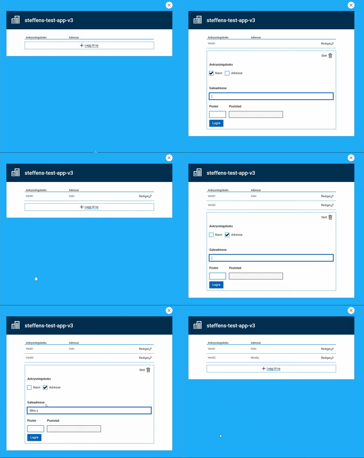
Below is a form with a repeating group that:
- Contains two components (checkbox and address)
- Can be repeated up to three times
- Is bound to the data model group/array
GruppeListe
Parameters
| Parameter | Required | Description |
|---|---|---|
| id | Yes | Unique ID, same as ID on other components. Must be unique in the layout file, and should be unique across pages. |
| type | Yes | Must be ‘Group’ |
| dataModelBindings | No | Must be set for repeating groups with form components inside. Should point to the repeating group in the data model. |
| textResourceBindings | No | Can be set for repeating groups, see description. |
| maxCount | Yes | The number of times a group can repeat. Must be set to 1 or more for the group component to work as a repeating group. |
| minCount | No | Validation. The minimum number of times a group must repeat before the user can submit the form. |
| children | Yes | List of the component IDs that are to be included in the repeating group. |
| edit | No | Options for how to display the group when editing a row. |
| tableHeaders | No | List of components that are to be included as part of the table header fields. If not specified, all components are displayed. |
| tableColumns | No | Object containing column options for specified headers. If not specified, all columns will use default display settings. |
| rowsBefore | No | Static Grid-style rows shown before the repeating rows in the table view. |
| rowsAfter | No | Static Grid-style rows shown after the repeating rows in the table view. |
textResourceBindings
It is possible to add different keys in textResourceBindings to overrule default texts.
title- title to show above the group row in a Summary component.add_button- is added at the end of the “Add new” text on the button, and can be used to e.g. get text that says “Add new person”.add_button_full- is used as custom text on the “Add new” button. Overridesadd_buttonif both are set.save_button- is used as text on the “Save” button when the user is filling out data.save_and_next_button- is used as text on the “Save and open next” button if enabled.edit_button_open- is used as text on the “Edit” button on the table when the user is opening an element.edit_button_close- is used as text on the “Edit” button on the table when the user is closing an element.
- Row editing settings
Change how to edit/fill out a row in a repeating group
- Table configuration
Configuration for the table that is shown above repeating groups
- Attachments in repeating groups
Specifics on how to set up attachment uploading in repeating groups
- Dynamic behaviour in repeating groups
How to hide rows in a repeating group
- Multiple pages within a group
How to show components in a group in multiple pages